Monday, November 29, 2010

Guest Blogger: ERIC DESCHAMPS


Hello. I am incredibly excited to be here on Muddy Colors and share a little of what I do. As a freelance illustrator and concept artist, I spend most of my time creating game art as well as character concept art for video games.


Since much of this blog is dedicated to traditional painters, I thought I would talk about my process as a digital artist. As I began to look through my artwork trying to find examples that best portray my method, I found myself eliminating a good deal of potential examples. I judged them not good instances of what I felt was indicative of my process. I hadn’t realized how much it varied from painting to painting, especially at the start. That is where most of my experimenting occurs. I approach each problem differently based on the assignment and also by mood.  These are some various approaches I have used in recent projects.

One comfortable starting point for me is using large positive and negative shapes. I use chunky opaque brushes to carve out silhouettes. This works especially well for complex commissions because I concentrate on the overall concept and composition, and avoid getting lost in details. I usually begin with three values: one dark, one light and the mid-toned “canvas." Once I am happy with a thumbnail, I hone in on the details.


Another starting point is the line drawing. Usually it is a simpler composition where I already have a solid idea in mind. After a few loose thumbnails I dive into a tight line drawing (at least tight for me). I paint my basic values underneath the line drawing, flatten it and paint the finish on top. This approach feels most traditional to me.


Recently, I experimented by using a photo of myself in what I thought might be a good pose and then heavily manipulated it and painted over it. Once I found what I was looking for, nothing of the original pose remained. It kind of felt like building with clay. Now that I had a solid direction, I went and took a new photo reference to help inform the new pose and lighting scheme. The end result was quite a bit different from what I imagined when I first got in front of the camera. This process was an instance where I had only a vague vision of want I wanted for the piece at the start and used photo-manipulation as inspiration.


Lastly, another approach was for a series of five ‘Magic: the Gathering’ artificers. I decided to thumbnail, sketch and paint all five on the same page, going back and forth between them tag team style. It was a lot of fun seeing them evolve next to each other. I just don’t think I could have logistically done this had I not been working digitally. I kept it going as long as possible until the file size just got too unruly and I had to separate them out to put the final touches on.


Thanks for allowing me the opportunity to share with the group.


***A Note From Dan***
Eric has put together a phenomenal video capturing the creation of his 'Vesner' painting. Unfortunately, Blogger resizes large videos, and as a result, you miss all the cool details. So instead, please be sure to click the link below and watch this awesome video in all it's glory.

Once upon a time...

Once upon a time artists would study under a master artist, adopt his technique, mix paint and learn how their teacher approached and dealt with the various commissions that came into his workshop. Sadly this method is no longer practiced in today's art colleges.


When I first started out on my journey to become an artist, I didn’t have a clue how to start a painting or how to approach a drawing for that matter. I didn’t even know what an illustrator was. Fortunately I had a great high school art teacher. His chosen medium was watercolor. Through his instruction I was able to produce work and derive a small income after a few short months of study. While I did have the raw talent it was through his guidance and constructive criticism that I was able to finally produce professional quality results. After many awards in high school and a subsequent scholarship to art school, I was faced with another challenge.... striking off on my own course. I needed to re-educate myself and apply what I had learned, channel my work, and strike off in a new direction. It happened gradually over the course of two frustrating years during art school. It wasn’t easy to let go of a previous formula that had brought me so much satisfaction, awards and income. Since my background had been in watercolor (mostly landscapes and still-life) the discipline of that medium helped me in my future attempts at redefining my work. Breaking into new subject matter and developing appropriate techniques was crucial. One of the things that kept me going in art school were the other talented students. I sometimes learned more from them than I did from my instructors. Our group would meet for coffee every night at a local coffee shop. Our discussions were about our assignments, jokes about our instructors and general shenanigans. The "mind fake" here was that while we were goofing off, we were still learning. The common angst of our artist insecurity was made less by our shared endeavors. Not only were we our own support group but knowledge of various techniques was acquired and dispersed throughout the group. The competition was friendly and we always celebrated each others accomplishments. Those friendships kept me in school. Happily after all these years, all of my art school buddies are still in the art biz.


Another avenue of knowledge and assistance came from the book: The Artist's Handbook of Material and Techniques by Ralph Mayer. This book has been in print for over thirty-five years that I am aware of (probably more). Many of the new approaches I was attempting in art school were validated in this book. It’s not the kind of book that you read from cover to cover, rather it serves as a guide for creating paintings using proven permanent methods. Just as feelings and sense impressions can create concepts for your work. this book will help you realize those concepts through sound technical practices. It may also be the catalyst for new ideas and trigger future directions in your work.


In conclusion - keep learning. Surround yourself with good, like-minded friends and associates. Keep your eye on the star and always work toward it.


Today I’m going to meet one of my old art college friends. It has been over thirty years and I know we’ll have a lot to talk about and maybe share a few new techniques. My high school art teacher lives a few miles away and we still see each other from time to time.


My high school art teacher: http://www.fredgraff.com/


My old art college buddy that I'm meeting for coffee: http://www.timbowers.com/

Thursday, November 25, 2010

Beginnings & Endings


Leading up to my recent show at LeBasse Projects I had been working around the clock to finish up the paintings. After coming back from LA it was straight to Altoona, Pa for Illux Con. And currently, I'm house/dog sitting in NY for a cousin of mine. I have been doing nothing for the passed few weeks but absorbing other peoples art; galleries in LA and NY, amazing work at Illux Con. Taking a lot of it in and letting it marinate.

Normally when I travel I bring all my supplies: fold up art desk, desk lamp, paints, palettes etc., and I work. These recent travels have been interesting, because I only brought pencil and paper. I wasn't even worried about art making really, mostly trying to get inspired for my next body of work. Exposing myself to as much as possible(in an artistic context). About two days ago I woke up thinking about my work and busted out ten sketches almost effortlessly. That never happens. I'm kind of excited about these so I thought I'd post a few of my early morning chicken scratches. The beginnings of what you may see fleshed out in the months to come. I'm also posting another beginning and the detail of an ending to recent previous months of work.

The next step from here. refine sketches, value/color studies, photo ref, transfer, paint. We'll see what happens.


Wednesday, November 24, 2010

Professional Framing & Happy Thanksgiving!


Ever since I started to attend conventions and exhibit original artwork in a public settings, I have always viewed framing as an integral part of promoting and advertising the quality of my work. In the context of exhibition, the frame is a physical extension of the artwork and for that reason I have always placed the greatest care and consideration in how I mat and frame my works. A cheap frame signals to a collector and client a lack of care and quality, both in the art and in the artist. Much in the same way a bargain off the shelf black portfolio belittles the art work within, spending money on a quality presentation means your viewers will immediately assess your work at a much higher thresh hold, regardless of what lies within.


It is easy to say, 'spend what ever it takes' as it is your career on the line. But when you are a freelance artist, watching budgets and considering multiple venues of self promotion, landing a high quality presentation at an affordable price is what being a wise business person is all about.

For years I have used various framers, from my local shop, Make a Frame, on Atlantic Avenue which provides me with exceptional service at a great price and hundreds of medium quality 'chop' frames to choose from, and a few high end custom cornered. The trip is all the more enjoyable since I have gotten to know the owners and workers there , Thorin, Matt and Tom, and they go out of their way to help me solve my problems. I turn to them again and again for a quick job and affordable solution.

But there are times when I want to 'spend what ever it takes', and it is then I hit the subway to Long Island City and step into Gala Frames. The way you find this place is walk down the dead end street, look over your shoulder for the Men in Black, take the elevator to the blast door on the 4th floor, and the step inside to...paradise. And I mean paradise. This place is one of those hidden gems of New York City. I first heard about Gala Frames from a friend, Dan Adel, who was exhibiting at Arcadia Gallery. I loved Dan's frames and had been looking for a way to 'step' up my display quality and to select a few special frames from pieces I wanted for our home. I was very impressed the first time I visited the shop. The owner, Nilda, has been in business for decades, she knows her stuff in and out and I now trust her with my finest works. When you get a Gala Frame, you get museum quality. Period.

But what is even more inpressive is that
these frames are affordable! No, they are not your $200-400 frame, which will land you a very nice one at most any standard shop, but for $700-3,000 you can have a frame meant for a Rembrandt that you would pay $6000-$15,000+ for in any other custom shop. Admittedly I do not go around popping all my works into these kinds of frames and prices, especially when they need to travel back and forth from conventions. But when I want a piece to sing, know that it will hang in my home for decades, or is such a beautiful image that I feel the frame will add exceptional value, then I turn to Nilda.


Contemplating how to choose from all those frame styles on the walls will fry your artistic circuits. They are so beautiful, well crafted and just gorgeous. They make you want to paint, just so you can buy a frame to hang on your wall. The desire to own one of these frames must be the same drive that others get when they start collecting original art. You want to treasure it. Nilda's frames are based upon many styles found on masterpieces in museums: from Dutch black massives, to Napoleonic golds, Art nouveau curves, and contemporary geometrics. The photographs of her place here only scratch the surface of what Nilda offers, and each frame is custom built for your art. Find a style you like, but not the right color? Nilda can change that. Right style but not wide enough? Nilda can expand it. Got a budget? Nilda can work it out. With so many options, you will walk away content every time.

If you ever have need of exceptional quality, the quick subway ride one stop into Queens is worth the trip. I guarantee it. And as a special bonus Nilda and Adam (her assistant) are some of the nicest people to work with!


Gala Frames
42-24 Orchard Street, Suite 4A • Long Island City, NY 11101
Phone: 718/706-0007 • Fax: 718/706-0731


Wishing everyone a safe, healthy and enjoyable Thanksgiving!


Donato

Tuesday, November 23, 2010

A Note on What´s Important


By Jesper Ejsing


I was drunk yesterday. Here in Denmark we have a tradition that goes like this: when Christmas time is around the corner, we get all together for Christmas lunches (meaning lots of old-fashioned greasy, meaty dishes and lots of alcohol) Well; this particular lunch happened to be with the guys at the studio, present and old members. Soon I got into a discussion about what is important in doing art as a pro. You know: one of those drunken discussions ending with 2 guys leaning into each-other drooling: “ I love you man”.
But before we got to that part, we talked about our attitude towards the process of creating images. And it got me thinking of what I think is important when I do my thing...
I have one rule. If I do not like a drawing, why would anybody else?
Above anything I try to satisfy myself first... yeah yeah, artistically, I mean.
I am not in this to make money or to just get the work approved. I always want to create the best painting of my life every time I start thumb sketching a new piece.
Needless to say, this raises the bar a bit, and, needless to say, it seldom happens.
But my point is, I try to make it happen. My wife hates when I say it. Usually this scene plays out when I come home from a day of sketching, the painting still in its infancy and the thumb so unclear that it could be anything, but none the less I have a great feeling about it and blurt out: “I think this will be my best painting ever”. That is when my wife sighs, knowing full well that I will be back the next day, moody as hell, tormented with insecurity and self loathing, like a helpless child, at how unable I am to reach that formidable picture I had in my head from the thumb the day before.
It is a bumpy road.
It is rollercoaster of ups and mostly downs, but in the end it is worth the struggle.
When a painting does succeed and when it is better than anything I have ever done before, it is worth every drop of salty tears and thrashed sketches. The feeling you get from taking a step up the ladder of skill or achievement is the best.
But it only happens approximately 3 times a year. Mostly the result is just decent.
Just decent doesn´t teach you anything. It is not worse or better than the last piece. Just decent is OK. But having set out to do The Best Ever, the just decent is a major disappointment.
Still, disappointments make me want to try even harder next time. “
THIS will be the best ever...”
and there we go again.
Here are a couple of paintings that I remember to have given me the feeling of success and grandeur. Some of them might seem like the rest of the fantasy stuff I constantly blotch out like a slow color printer from the 80s´, but to me these are examples of pieces where I dared something new and difficult and got it right, where the process taught me a lot and helped define where I wanted to go as an artist.


Monday, November 22, 2010

Painting a Series

-By Dan dos Santos


One of the great things about painting the covers to Science-Fiction and Fantasy novels, is that the genre tends to reap a lot of sequels and trilogies. The benefit of this is two-fold. Not only does this mean more reliable commissions (as an AD will rarely swap artists mid-series), but it also presents the Artist with an opportunity to tell a better story.


An Author has hundreds of pages in which to capture the essence of their character. The Illustrator on the other hand has just one shot. Unless, of course, the book is part of a larger series. Then we are presented with a chance to flesh out a character further than we could on just a single cover. With the initial cover behind us, and a hopefully faithful readership already established, the hero doesn't have to be 'super-bad-ass' or 'in-your-face' on every subsequent cover. Instead, you can explore a vulnerable side to them, or maybe an introspective moment, or perhaps a subtle eroticism. For me, this is one of my favorite aspects of illustration... developing a character, and not just a generic pin-up.


A series also presents the Artist with a chance to create a 'theme', a visual thread that ties the whole group together. In the 'Mercy Thompson' series shown above, the tattoos are the most obvious theme. But there are other themes that are more subtle. For instance, the character always appears 'head to knee', and is always the exact same size on each cover. This may not be important as far as any individual book in the series is concerned, but when you see them all together on a shelf, it adds a great sense of cohesiveness.


Another series that I work on is the 'Willow Tate' novels, written by Celia Jerome. In the story, 'Trolls in the Hamptons', Willow is a female comic book artist. Uncannily, whatever she draws seems to come to life. It is not made clear if she herself is causing these things to happen, or if her drawings are simply precognitive.


It's a really interesting story, and it presented me with some wonderful opportunities to experiment quite a bit. I have always had a real passion for comic books, so I couldn't pass up the chance to incorporate a looser, more comic-book style into the image. Of course, that's a bit difficult to do in paint, so I also experimented with splicing my traditional oil painting with a digital background. In the image to the right, the background was drawn and colored entirely in Photoshop. The woman and her desk are all painted in oils. Having painted her on a pale yellow background, it was very easy to then splice the two images together.


It's still to be seen whether or not the cover is successful, since the book just went on sale this month. But the publisher has contracted several more novels regardless, and has already commissioned me to do the second in the series. Again, we decided to maintain an obvious theme, and use the comic-book style background a motif throughout the whole series.


The second novel is titled 'Night Mares in the Hamptons'. Given the nature of the title, I thought it appropriate to make the image a bit darker than the first, both literally and figuratively. The palette is much darker in value and cooler in tone, creating a more dangerous atmosphere. The actual content is also a bit darker. The heroine is not smiling like in the first cover, the fire seems threatening, the man is not in a romantic embrace this time, and the mares are obviously in distress. All of these elements together help create a coherent mood, and provide a stark contrast to the fist novel. Meanwhile, the stylized background, and narrative nods like the pendant, ensure the series holds together.


Rule of Thumb


Occasionally I'm asked for advice from artists fresh to the field (some of you who know me far too well are shaking your heads and muttering, "Those poor, misguided boobs"). Though I'm happy to blather about any number of things, I'm always quick to point out that a career in art isn't the same as baking a cake. There's no set recipe which, if you follow it carefully, will yield the same results for everyone. What works for one person sometimes turns out to be a mistake for another.

Of course, when talking about portfolios and presentations I'm hard-pressed to come up with a more clear-cut set of guidelines than Irene Gallo shared a few years back on her Art Department blog: rock-solid advice that all artists can benefit from by reading. Donato just made a good post on Muddy Colors about self-promotion and gaining confidence through experience, Greg Spalenka is doing great work with his Artist As Brand seminars, and we're getting all manner of wonderful tips and insights both here and in other art-centric blogs on the Web (including, naturally, Jim Gurney's outstanding features).

So—as a Rule of Thumb—I tend to keep my advice fairly general, based largely on what I've learned and seen through the years. And, as with all such "rules", these aren't really rules, aren't strictly accurate, and aren't exactly reliable for every situation. But what do a advise? Well, here are a few...

Don't Put Down Other Artist's Work
It only makes you look (1) envious, (2) boorish, (3) stupid, and, in general, (4) bad. Or some combination of the four. Sure, when you're sitting with friends having beers, you can talk shop and express your honest opinions—but never forget that not everyone has the same taste in art (including your friends) and art you deem dreck others might truly love. Especially don't forget that you never know who knows who and who is likely to spread your comments—and not in a way that's to your advantage. Now, if Artist Winsor Colors ran off with your significant other or stiffed you for their half of the rent or mashed your dog on the highway, feel free to point out their failings to someone that will lend a sympathetic ear. But, as a fellow illustrator, leave their work out of it. And never—never—under any circumstances talk smack about a fellow artist to your clients or art director friends: messing with another's livelihood, even in the most cursory way, is a big no-no. Frazetta had a falling out with Al Capp after ghosting Li'l Abner for him for some years and even decades later after Capp had died he observed the fine line between personal and professional. "Capp was a miserable S.O.B.," Frank told me, "but he was quite the artist. I'd never knock his talent."

Never Stop Learning
Never miss an opportunity to watch other artists paint or listen to them talk. Never stop going to galleries and museums or miss an opportunity to see touring exhibits. Never stop looking at books or the published works of your peers to keep abreast, not only of what's being done, but of what's proving popular in the marketplace. Never stop looking at work that falls outside your area of interest. Never miss an opportunity to socialize with your fellow creatives, at conventions or openings or...wherever. (Good art can't grow in a vacuum.) Never become complacent with your skill level; always try to improve. Always—always—press the envelope. We get letters from James Bama after every edition of Spectrum comes out and he ends them almost the same way each time: "Every morning I get up and paint in the hopes of one day being as good an artist as I hope to be." Words to live by.

Your Employer/Client Isn't Your Friend
It's good to socialize with art directors and games producers and film makers and, well, everybody. But...decisions get made for any number of reasons, sometimes by people who aren't your friends, but whom your friendly art director reports to. Try to keep a wall between, again, the personal and professional. Do your work, do it on time and to the specifications of the brief, don't ask for favors based on your personal relationship, and demand the same treatment from the employer/client. If you work for a corporation don't expect them to be your family (much as they try to cultivate that impression): you're there to do a job and their obligation is to pay you for doing it. An epiphany came to me during a performance review many years back when I was a senior designer for Hallmark Cards: I was pointing out all of the extra work I had done, all of the extra time I had put in, all of the contributions I had been making above-and-beyond, all the money my art and ideas were making for them, all because I cared and we were "family" and I wanted what was best for the company (and, of course, I wanted to get a promotion in the process). And my supervisor at the time (who I had known for something like 15 years) looked at me blandly and said, "So who asked you to?" It was the proverbial splash of cold water in my face. No one had "asked" me: it was my mistake, not theirs (though they were perfectly delighted to take the "freebies," at least until I started asking for something in return). Hallmark stopped getting the "extras" from me from that point on—and they paid me quite well just the same. Not that I didn't do the work with any less care, not that I approached the job with any less professionalism, but I definitely had a much more realistic view of how things worked corporately from that moment on. I had let the lines blur between personal and professional—and I never made that mistake again.

Don't Work On Spec
That's not the same as doing pro-bono or charity work, both of which can and should be done as you deem appropriate. No, what I'm talking about is when someone has a simply TERRIFIC idea—but no money—and wants the artist to work some magic for them so the entrepreneur will have something to show prospective suckers...er...investors to make the project a reality. These sorts of pie-in-the-sky projects almost never come to fruition or, if they—miracle-of-miracles—do, they virtually never turn into a paycheck for the artist. Work for pay, get everything in writing, and don't fall prey to the shysters. Likewise, if someone wants to use your art, demand compensation of some sort. Harlan Ellison (viewable here) in an absolutely magnificent outburst in Dreams With Sharp Teeth, talks about paying the writer: it goes the same for artists.

There's more, naturally: as I say, I can blather on and on. Let me know if you'd like more.

Friday, November 19, 2010

The Mud of Venus, Part 2


"I can paint you the skin of Venus with mud, provided you let me surround it as I will."
- Eugene Delacroix

In the first part of posting on this comment by Delacroix I dealt with the technical aspects of his work, this second part will deal with the business.

A highly successful artists like Eugene Delacroix did not achieve such broad recognition and respect for his art merely by being a great oil painter. Rather it is a combination of strong business sense joined with great technical virtuosity which produces the super stars of any art genre. These traits may be found in such showmans as Picasso, Dali and Rubens, or the trusted and respected court painters of Holbein and Velazquez or the independent artist like Rembrandt. Managing studio time and driving the wheels of self promotion is what is needed by an artist to push their art into the limelight. Far too often inexperienced artists assume that studio merit will be enough to guarantee a successful career.

Part of Delacroix's success was derived from his ability to sway clients away from other choices and into his studio. I cannot imagine the competitive nature to art as
changed much over the centuries as thousands of talented artists constantly vie for the limited commissions which exist in the marketplace today . Sheer bravado, like the statement above, was more an advertisement for commissions than a call challenging his painting skills. As I have mentioned, Delacroix already knew that painting flesh required creating it out of 'mud', he was stating the obvious to any painter in earshot. But to the layman or art collector the skills of such a gifted artist were like that of a magician, and to raise such a public challenge must have seemed highly risky to the reputation if failure resulted and utterly amazing if the challenge was fulfilled. Makes me think of Houdini's public feats, putting his life at risk and going far beyond what many artists would do for their work. But that is another level. The dice were loaded by Delacroix - and created a wonderfully imbalanced state to enter into negotiations with a client!

It was taken me years to place myself in such a state where the balance is weighted in my favor. This past weekend I attended IlluxCon, a science fiction and fantasy convention devoted to the art of the genre and heavily attended by professionals in the industry including artists, art directors, collectors and serious fans. And just like Delacroix, I stacked the deck in my favor. Not by proclaiming my technical virtuosity, but by showcasing some of my best oil paintings and drawings in beautiful frames, and by presenting lectures in a structure I was both familiar with and knowledgeable about. I even went out on a limb trying out a new lecture on Abstraction in Realism, thinking I was attempting new territory. It was a hit, judging not by my accounts, but by the numerous artists and viewers who approached me later in the weekend to comment on how informative and entertaining it was. But when I presented the same lecture in my class room at the School of Visual Arts on Monday, I realized that nearly 1/3 of the lecture was material I had already covered for years!

Performing live demonstrations, lecturing, socializing at events and displaying art requires experience to make it appear smooth and effortless. The ease in which I negotiate a seminar or demonstration was not an attribute of the young artist I was 15 years ago! Far and away it was not! I hated attending openings at the Society of Illustrators, not knowing what to say or how to break the ice. And my live demonstrations? Ouch! head down, quiet as a lamb, thinking that making a nice piece of art was more important than communicating my process. There is a place for perfection and that resides in the studio, not in a one hour demo. Build upon your strengths in what ever art you undertake, and use that to leverage projects, clients and commissions to break into new territory. Your strengths might not only be a part of your technical ability, but might exhibit themselves through various social and business interactions experienced during the development of your career.

The earlier you begin to tackle aspects of self-promotion, the quicker your confidence and clarity will mature in their delivery. And the sooner you can stack the deck in your favor...

Donato Giancola


Thursday, November 18, 2010


I had the pleasure of meeting Jordu Schell the other day as he gave a wonderful presentation of his work, the field of special effects, as well as a sculpting demo to a massive audience At Rhode Island School of Design. I must confess I am a huge fan of Jordu, I love sculpting, love to see sculpture, love to learn the process (I am the annoying guy asking silly questions in the back) and I love to sculpt. Sculpting helps me understand the shapes and volumes that I am trying to get across in 2d form. Sculpting is hands on experience in structure, how forms turn in space, why edges might be sharp or soft in perception, how gravity effects form, how.... but I digress this is an introduction to the wonderful and amazing world of Jordu Schell, a charmer, an eccentric and a wildly passionate artist.

Check out his site for lots and lots of cool works as well as info about his classes.

http://www.schellstudio.com/

Wednesday, November 17, 2010

"The Vanishing" photo ref


I was asked about my photo ref from my previous post. As you can see the figure in my final is fairly different. But the ref allows me to flesh out the piece and add in details and information that I think improve the piece greatly. I could try and make it all up from my head but even then I'm just referencing the vague images in my memory of things I've actually seen. Even if you have photographic memory I'm doubtful you would have seen the exact forms you need with the exact garments, color, lighting etc.


The trick for me is to maintain the stylization and freshness in my sketch and wrap the information provided by the photos around it. Sometimes my sketches are so far off in anatomy I make some minor changes. I always sketch, design, compose out of my head. This way I'm not bound to anything that may limit my design. When major issues are solved and I feel the piece is ready. I then take my ref trying to match up the model to the figure in my sketches. I hear from a lot of aspiring artists that they are looking online for the "perfect" ref. I feel this is very limiting artistically. And to be quite honest if you spent the time setting up a photo shoot(who doesn't own a digital camera nowadays?) you would save yourself some time and have ref that is exactly what you need. The more I take ref, the more I study it and try to understand it, ie folds, drapery etc. the more I can file away into my visual vocab. Over time I become more familiar with the subjects and when I do need to make some of it up out of my head I can do so with a little more confidence.


Another quick point before I forget. I think when you are constantly making things up out of your head they tend to repeat themselves. The same folds, the same hand at the same angle. You get the picture. A lot of cool unexpected things can happen in your photo ref. This too helps to keep your work fresh.


Here's another example of some of my previous photo ref.

Tuesday, November 16, 2010

Weird Wizard of Oz


Spectrum 17 is out and it is my good fortune to have the cover image. Especially on a nice white background. (Thanks, Arnie! ) I’m a fan of white backgrounds. Probably an influence from the Saturday Evening Post and a decade of the best paperback covers in the world. 
I love that crisp edge against white, and usually with a perspective that keeps the ground at level view, looking at the toes of shoes and upward towards the head. We hardly ever observe this point of view in life, but we feel it. We feel like we take in the entire figure when we see someone coming toward us, but we are really only focused on a very small part. The rest is impression.
I’ve been a fan of the Wizard of Oz story since my whole family sat around a b/w tv set while I was a kid, watching Hallmark Cards sponsor the rerun of the 1939 movie every spring. Every year, my parents would argue about what scenes had been cut from the original. I was alway curious about those left out scenes. I thought my folks were mistaken, until I watched the LaserDisc version that had background material...and deleted scenes. After all, my parents had seen it in a real theater, when it came out. It’s very likely the first version included those scenes in the initial release.
This painting was going to be different though. I wanted to take the basic story premise and change it up. Dorothy became a goth Asian chick, the Scarecrow became a highwayman, the Lion got some cahones and became a saber tooth, and the Tin Man became a robot. Little Toto had to man-up and became a bull terrier. I was not a fan of Toto as a kid. I had a real dog.
I started with Dorothy, moved to the Scarecrow, then the Tin Man, the Lion, and finally Toto. I drew them all separately and projected the individual sketches onto my canvas. I designed it on the wall, building the composition I had in my head as I completed the pencil drawing.


Here’s a shot under the projector.


I brought the prepared canvas to the Illustration Master Class that 9 of us teach every June in Amherst, MA. It was one of two demo paintings I did during the week. We used the W of Oz story for a book cover assignment for the class, but with a slant toward steampunk. What a treat to work with all of the painters and their ideas! One of my favorites (everyone’s really) was our own Justin Gerard. A killer piece.
To start, I sealed the drawing with acrylics, and began painting the Scarecrow. I finished most of it that week, but it sat for about 6 months before I decided to finish it. It was just a fun project for me. I’ve since written two chapters of my reworking of the story. Maybe I’ll get to illustrate my version someday....maybe test out a chapter on you guys here at Muddy Colors!

Tom Reviews "Scott Pilgrim vs. the World"

Tom's Corner:


Scott Pilgrim Vs. the World
(2010, Edgar Wright, director)

“We are Sex Bob-Omb, and we are here to make you think about death and get sad and stuff.”

Ok, we all know the hype surrounding Scott Pilgrim. Bryan Lee O'Malley's six graphic novels (available anywhere comics are sold) were condensed into one 2 hour movie. But was Scott Pilgrim worth the price of admission? Oh yeah...

First off, let's talk about the stellar cast. When you base a movie on...well, anything, it's hard to get a cast who can really embrace the characters. This cast did. Let's start right at the top: Michael Cera, who I've been hard on for playing the same character again and again (you all know what I mean) plays Scott Pilgrim to perfection. Scott is your average bass-playing underachiever, who has little to no responsibility in his life. He lives with (and in fact shares a bed with) his gay roommate, Wallace Wells (Kieran Culkin). Wallace gets so many of the lines that make you laugh out loud it's almost ridiculous. Culkin needs to be in more movies, and now. Next up we have Scott's “high-schooler” girlfriend Knives Chau (Ellen Wong). Wong nails Knives' obsession with Scott, and you really feel for her. Scott's band, Sex Bob-Omb, are Stephen Stills (AKA the Talent, played by Mark Webber), Kim Pines (Alison Pill), and hanger-on Young Neil (Johnny Simmons, escaping from the black-hole of suck Jennifer's Body). SBO are a new band who want to win a local battle of the bands.

As he goes out with Knives, Scott meets Ramona Flowers (Mary Elizabeth Winstead). He falls head over heels for her, and after stalking her a bit (in a non-creepy way) he asks her out. It is then he learns he has to fight her seven evil exes to win her hand.

Wow, the fights are so well done. Combining animation, video game elements and incredible choreography, each fight will keep your attention and make you laugh. And the evil exes are hilarious: Brandon Routh, Chris Evans, and Jason Schwartzman number among them. The rest of the cast is equally great.

Now, the one caveat I will issue to the fans of the comic: they did take six 200-300 page books and condense them into a two hour movie, so there were a LOT of parts that were cut out or changed. That being said, the spirit of the comic series is alive and raging. See this movie, you'll definitely be entertained.

- Tom

The Most Mind-Blowing Images I Have Seen in My Life: Part I


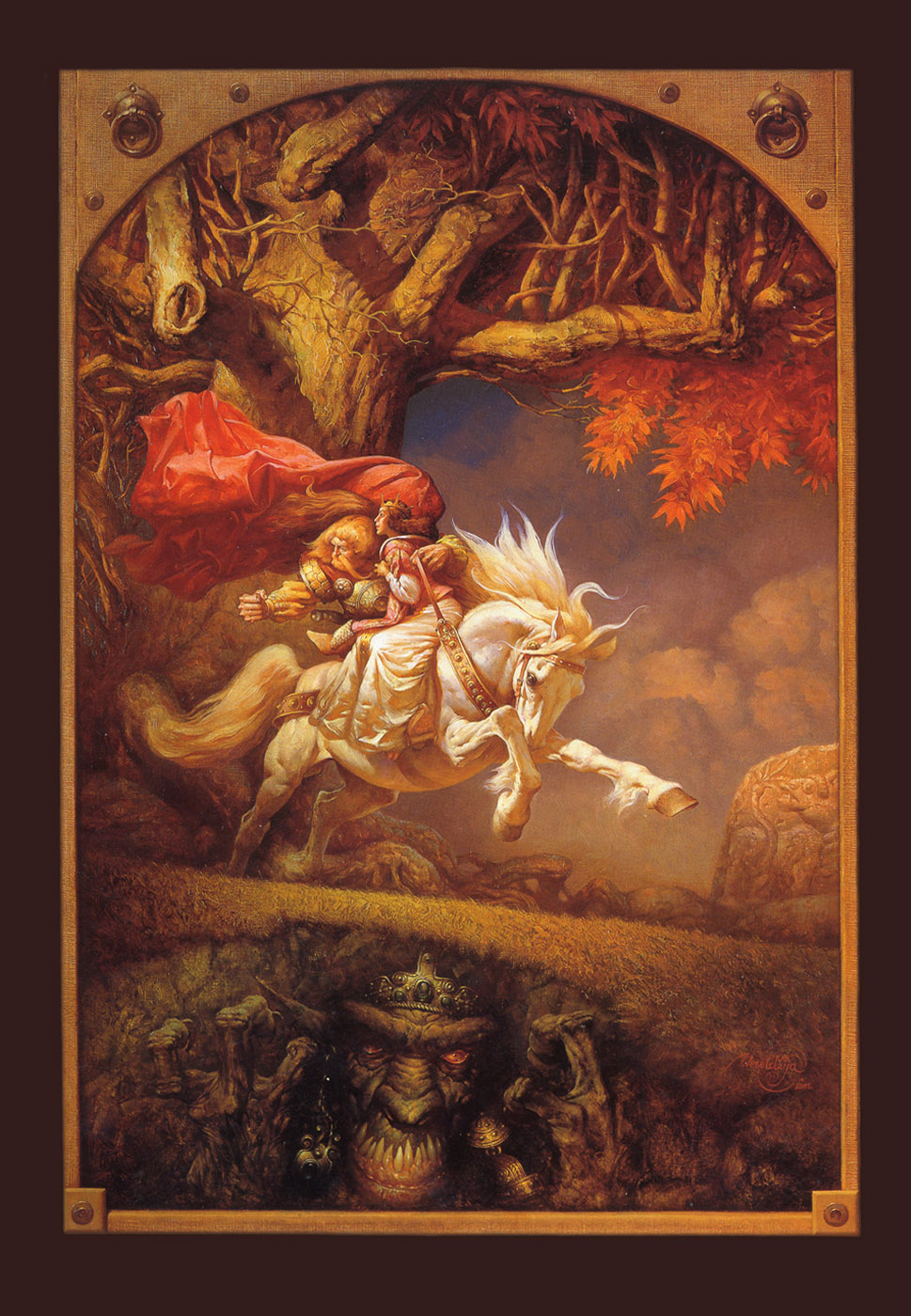
What you see before you is the cover of Petar Meseldzija's Book, The Legend of Steel Bashaw. It is one of the most exceptional paintings I have seen in my lifetime.


Like many of you, I first saw this image in Spectrum 9 where it dropped a nuclear bomb on my brain. Never before had I seen an image that so clearly articulated every feeling that I had ever hoped to communicate in art. And never had I seen one executed with such earth-shattering beauty. It was flawless, riveting, and the more I looked at it, the more and more I was drawn into it.


 Now you will say, "Justin, calm down, it's just a picture. It's a dude, and he's on a horse. You're getting carried away."

But this is more than a dude on a horse.

It is a diatribe against mediocrity and an air raid call to the pursuit of excellence in art. When I saw this painting it gave me the same desire it has given many other artists who see Petar's work, it made me want to change everything.


Not only did it instill in me a fervent desire to learn how to paint, but to make images that were worth meditating on, and not disposable imagery destined to be lost in the vast sea of imagery we exist in.


 For a long time I had believed that it was essentially hopeless. The attention span for visuals shrinks as digital photography and digital displays increase and lead to a greater proliferation of imagery. In this new digital world the best images are those that are the most simple and the most brief. People are conditioned away from lingering for very long on a single image in the marketplace. There are so many other ideas out there, so many other things to consider that it becomes almost morally wrong to create something that demands a person dwell on it exclusively, instead of moving directly on to the next idea. Meditating on a single idea becomes an anathema. Even movies find that in order to keep up with the shrinking attention span, they must make scene changes faster and faster to keep audience interest. But in the pursuit of communicating a quantity of ideas we seem to lose the ability to meditate on the quality of a single idea.


 This image was one I got lost in and never quite made it back out of. It defied the technology-perscribed cultural direction that I sensed was to be the inevitable demise of narrative illustration. After seeing this image I knew that I wanted to make images that were mediations on ideas, and not just flashcards of them.


 On top of being a artistic philosophical turning point for me, it was also a technical one. If you haven't already noticed, this painting is a city-crushing, Godzilla vs. MechaGodzilla of technical achievement. It is first extremely precise, with profoundest care taken in the focal points, such as the horses thrusting hoof, which focuses the action there for a brief moment as the eye moves through the composition. And then in the areas that are not meant to fight with the focal points, such as the body of the tree and the rocks beneath, there is an elegance and economy of brushstrokes that show a care in execution that borders on perfection. These subtleties are gorgeous upon examination but slip passively into the background when any of the focal points are examined.

One might perhaps think that the success of this painting is the result of chance, that these are not mortar bombardments of awesome-ness but are rather just a few lucky strokes, the result some secret medium that he mixes on the panel before applying the paint.


 The truth is more devastating.


I had a chance to visit Petar in 2009, and while there he took the time to show me some of his drawings. I had always considered myself to have a passable drawing ability and felt that I knew a thing or 2 about the craft. I was a professional after all.


 When he pulled out his preliminary drawings that he did for his paintings, I saw the greatest drawings I had ever seen in my life and I blacked out. And while I was blacked out, I had a vision.

It was Judgement Day, and I was giving an accounting of myself before the angels and saints. My art was being brought out and passed around. I learned that it was to be compared against Petar's art, which someone had decided was to be the standard by which all drawings from the era were to be judged. The saints and angels wore grim, unimpressed expressions as they shuffled through my pages of scribblings. Then they started watching the recordings from my life of me playing video games instead of working on my drawings and I woke in a panic.

I smelled coffee. (Petar makes a turkish coffee so strong that the mere smell of it would wake a hibernating bear who was frozen in a block of ice under 40 feet of snow and who had just taken 12 Ambiens and was listening to Blue Danube by Strauss.) He handed me a cup and asked if I was OK. 


As we looked through the rest of his drawings I realized that his paintings are not just the result of an excellence in the ability to apply paint, but that they are also the result of rigorous practice in drawing and extremely meticulous planning in the draft stages where he seeks to resolve the visual problems in his image. I realized that Petar is a genius. I felt like I was looking at the blueprints for the invasion of Normandy. While I could not expect to ever be so flawless in my approach I realized that if I was serious about this I would have to take drawing to an entirely new level that I had never even considered before.


 If you have not already, check out his book, The Legend of Steel Bashaw from Flesk. In the back are included some of the drawings for the project. If they don't nuke your brain, they will certainly knock your socks off. It is one of the most valuable books for the practicing artist to come out in years. Check out the rest of his work on his website here and his new blog here.


Sunday, November 14, 2010

Orphans & Reservoirs

There are several initial steps to create successful images for cover assignments. Some have been explored in this blog. We’ve seen the thumbnail approach - custom thumbnail sketches for a specific cover. Drawing numerous thumbnails, refining the image until it satisfies your client’s sensibilities and hopefully yours as well. Working with the visual concepts of a project. the setting, models, costumes and all of the other elements that are necessary can be stressful and sometimes frustrating.

There is another path to cover art nirvana. Simply keeping a sketchbook... not just any sketchbook... but an ongoing record of fully realized visual concepts. These ideas can be topical, surreal, political etc... the choice is yours’. This is a surefire way to create memorable images that will eventually be adapted for future use. To create without pressure, restrictions or deadlines is contemplative. No, I’m not talking about drawing hands or eyes or other academic exercises but creating an ongoing reservoir of ideas. Think of it as your personal visual thesaurus. Visually meditate, keep the concepts simple. The details and subsequent studies can be created later. These drawings should act as your aesthetic spirit guide. By not becoming a slave to the text, the artist can free themselves to create evocative images without boundaries. Some of you have already used this approach. If so, you have realized the personal fulfillment derived from having your root idea become a published piece..... It is the magical alchemy of a wandering mind that makes this possible.

Novels published today have many elements in common. Since these stories often involve similar concepts, archetypes and subjects, there is no reason that artists shouldn’t visually pre-engineer some of their images. Hence, the thesaurus sketchbook. This sketchbook could also be viewed as a personal source of stock images. The difference here is that the raw data in these orphan sketches may be unique and unrestrained. The drawings and concepts will probably need to be tamed and dressed-up for presentation. The overly wild ideas can always be reserved for your personal work. Making the connection from a root drawing to a current commission is part of the magic. These root drawings will help you realize your artistic aspirations.

I’m not suggesting that you abandon the traditional custom thumbnail approach ( we all use that method) but using a visual reservoir will enhance and streamline your conceptual process.

Creating a evocative image without a home is very liberating and euphoria is its child. This process may give those orphaned root concepts a place to live in the publishing world. Although this approach may not be anything new..... it works for me.

Below is an example of using this visual reservoir method. I have used this approach to trigger and assist cover development on many assignments.

Background and root sketch:


I was watching the news on television a few years ago. The news report dealt with a protest at a nuclear power plant. During the report the camera showed antinuclear protesters manipulating a giant skeleton puppet outside a nuclear facility somewhere in Europe. What a great image I thought..... so I created a very rough sketch and forgot about it.

Even though the original sketch was very simple..... In my mind I could already see how I wanted the final painting to appear. Years later, I received a commission for a Charles deLint novel that included scenes from the Mexican holiday, “Day of the Dead”. I referenced one of my many reservoir sketchbooks and there was the root idea. Simple, rough, but adaptable. This gave me a direction for further development.

Thumbnails
I eventually submitted a variety of sketches for this cover that also included the revised root sketch. The client chose the reservoir based sketch.


Studies and final painting:
The subsequent studies and final painting were, for the large part, created without reference. I had my oldest son pose for the central figure holding the puppet’s main support.


Footnote:
An interesting event occurred when this painting was finished and submitted,. The author thought the subject matter was very unsettling for his novel and it was respectfully rejected. The 1st cover version only appears on the Advanced Reading Copies (ARC) that TOR Books distributed to the press. TOR Books then commissioned a 2nd cover. The female figure’s pose for the 2nd cover and subsequent final published version also came from a reservoir sketchbook concept. One method - two different results.