Thursday, June 30, 2011

Zero to Sixty

-By Dan dos Santos


If you're one of our West Coast readers, this opening may be of interest to you:


“Zero To Sixty” marks the fifth anniversary of Corey Helford Gallery opening its doors in Culver City, California, and on Friday, July 1 the gallery will salute the occasion with its most exciting group exhibition of the year.


For the momentous event, more than fifty artists from around the globe were invited to create a special piece for the anniversary show. The exhibition will include new works by celebrated artists who have shown with the gallery since its inception: Natalia Fabia, Sylvia Ji, Buff Monster, Kukula, Lola, Korin Faught, Brandi Milne, Eric Joyner, and David Stoupakis.


“Zero to Sixty is a show of what’s best at Corey Helford Gallery and what’s to come — new works from the artists who’ve shown with the gallery from the beginning and a host of works from artists we just love, like Joe Sorren, Todd Schorr, Greg Simkins, Kent Williams, Nick Walker, Sas and Colin Christian, and also some artists who have never shown with us before, like Meggs and Kazuki Takamatsu,” explains gallery owners Jan and Bruce Helford.


Open to the public, the reception for “Zero To Sixty” will take place on Friday, July 1 from 7 to 10pm.


Aside from showcasing the the works of industry veterans like Kent Williams and Anita Kunz, The Corey Helford Gallery also boasts a wonderful roster of young up-and-comers who are sure to make their mark on the industry as well. Two of my favorites of late have been Mia Araujo (seen above) and Billy Norrby (seen below). Both of these pieces will be included in tomorrow's show. More to come on these two fine artists soon.


Flesk Prime

By Petar Meseldzija


Good day to you all!


I have an announcement to make today. There is a new and exciting book coming out in July from Flesk Publications, titled FLESK PRIME.


This is what the publisher says about it in the introduction:
“Flesk Prime serves as a fresh look into the imagery of five exceptional artists: Craig Elliott, Gary Gianni, Petar Meseldzija, Mark Schultz and William Stout. The essence of each craftsman is captured here to satisfy their fans as well as individuals who are enjoying their first glimpse. The section on each artist begins with an introduction and a biography written by Flesk publisher John Fleskes. The five were invited to handpick their pieces for inclusion, to showcase the best representation of their work. Furthermore, new quotes have been obtained to capture the artists’ own thoughts. Each chapter shows the dynamic range of styles and illustrations and unique diversity of these five creators…”


The book is only available direct from Flesk Publications ! If you want to learn more about the book and to purchase it, please go to Flesk Publications


Needless to say, I am proud to be a part of this beautiful  book alongside with some legendary names from the comic/illustration field. I hope you will forgive me this act of lack of modesty…
Cheers!


Michael Miller on the Editing of "HappyThankYouMorePlease"

Here is a great piece featured on the Filmmaker's Diary Blog from acclaimed editor Michael Miller on the editing process incorporated into 2010 Sundance favorite "HappyThankYouMorePlease." Very interesting from a collaborative filmmaking point of view, and I'm sure this process could be useful to some filmmakers in the future.

Michael R. Miller has had a dream career in film editing. After graduating from Cornell University and working briefly in commercials, he landed the plum job of assistant editor on Woody Allen’s MANHATTAN. He worked in the same capacity on Mr. Allen’s STARDUST MEMORIES and on Martin Scorcese’s RAGING BULL. Subsequently Mr. Miller became a sound editor on Joel and Ethan Coen’s BLOOD SIMPLE, and went on to collaborate with the Coen brothers as picture editor of RAISING ARIZONA and MILLER’S CROSSING. His many other editing credits include Terry Zwygoff’s GHOST WORLD, Herbert Ross’ BOYS ON THE SIDE, Thomas Carter’s SWING KIDS, Rocky Morton and Annablel Jankel’s D.O.A., Keenan Wayans’ I’M GONNA GIT U, SUCKA, Paul Dinello’s STRANGERS WITH CANDY, Michael Bay’s ARMAGEDDON, Rupert Wainwright’s STIGMATA and Anthony Hopkins’ SLIPSTREAM.

He recently edited Josh Radnor’s HAPPYTHANKYOUMOREPLEASE, winner of the 2010 Sundance Film Festival Audience Award, available on dvd since last month. Recently, Mr. Miller directed a music video, "Sick and Dying," for the extraordinary Amanda Jo Williams. His writing about film and filmmaking has been widely published.

Here, he describes this very detailed, organic method of editing the film:


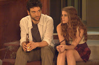
"Josh Radnor’s happythankyoumoreplease, winner of the 2010 Sundance Audience Award, opens today in New York and Los Angeles, then goes wider on March 11th. Editing the film with Josh was a genuine pleasure, despite budget constraints often (and rightly) associated with independently financed productions. It was also a learning experience.

Of course, one learns while working on any motion picture, as each presents an array of unique circumstances. What I gleaned from cutting happythankyoumoreplease was that digital camera technology, used primarily to lower shooting costs, has aesthetic advantages, too. Before discussing them, though, l should say a word about the economic boon that comes from using gear like the Red Camera, Panavision’s Genesis and the Canon 5D.

Savings accrued from shooting digitally are staggering. Even with the best deals on film stock and lab processing, and hour of film costs around $3000. 60 minutes shot digitally is $25, less than 1% of that! The chief selling point for eschewing celluloid, then, is price.

And there are economic benefits of digital cinematography besides lower footage and lab costs. For instance, filmmakers using the latest cameras can shoot for an hour without reloading. A magazine of 35mm film, on the other hand, is empty after 10 minutes. Thus less time (and, therefore, money) are spent changing camera rolls when shooting electronically. What’s more, running out of film in mid-take -- a frustrating, costly and not infrequent occurrence when shooting analogue -- is unlikely when using digital cameras.

The abilitly to record for an hour before “rolling out” is precisely the financial advantage Josh turned into an aesthetic one while making happythankyoumoreplease. Ironically, this directing breakthrough was first presented to me as a descent into lunacy. Phoning from the film’s New York location, one of our producers exclaimed, with great consternation, “You’re gonna get a 40 minute take in tomorrow’s dailies! For a two minute scene!!”

But there was a method to Josh’s madness. He wasn’t just shooting compulsively. Rather, the director used long takes as a rehearsal process. He refined performances while the camera was rolling. As a veteran Broadway and television actor with an MFA in theatre, of course, Josh knew the value of rehearsing, and had to address the fact that low budget indies like happythankyoumoreplease don’t provide time for it.

He also wanted to restore the cut corner of rehearsals because of what he’d learned during his thoroughgoing study of filmmaking in the run-up to principal photography. In addition to picking the brains of seasoned crew members and grilling How I Met Your Mother director Pamela Freyman, Josh read extensively about cinema. One of the texts that inspired him was Sydney Lumet’s Making Movies, which begins with a memorable chapter on rehearsing for film. Perusing this material convinces the reader (who is somehow left craving fresh rye bread, danish and strong coffee) that the rehearsal period is indispensible.

So Josh Radnor incorporated rehearsing into each take, refining performances while the camera turned. Yet with sound and image being recorded non-stop, unrehearsed moments of brilliance were never lost. The work method was similar to that of jazz producers who, when making a record, roll tape even during warm-ups in order to capture any and all inspired playing.

Undoubtedly, this production strategy changed my editing modus operandi, because the concept of a “take” no longer applied. Working with film, a director and editor might agree that Malin Akerman’s “more please” monologue was best, say, in the third take of her close-up. Shooting with the Red Camera, though, Josh could have 10 or more readings of that monologue (and sections thereof) in the digital entity slated “Take 3.” So the old vocabulary ceased to apply.

Using digital editing technology, I placed “locators” (colored markers) in a visual timeline of the material indicating starts and stops -- takes within takes. Thus I could combine the fifth reading of the first part of a line in “take 6” with the third reading of the second part from “take 4” easily, mouse-clicking on well-labelled dots to move those sections into an assembly of the movie. (Both Avid and Final Cut Pro have locacator “tools.”)

In addition to facilitating construction of happythankyoumoreplease, this work method lightened the mood in our editing room: my speed-typing was so bad, it often gave Josh something to laugh about. Locators guiding us to “Close-Ips of Ammie” or “Folly Shots of Nississippi” kept the director amused -- always a good thing during the intense process of cutting a film."

- Michael

Original article HERE.

Tom Reviews "Hall Pass" DVD

Tom's Corner:


Hall Pass
(2011, The Farrelly Brothers, directors)

Sometimes I like to punish myself. The Farrellys haven't put out a good movie in a while, so I thought, what the hell, I'll watch “Hall Pass.” This statement proves that I am, in fact, a complete fucking idiot. Journey with me to the world of predictability and limited funny. Journey with me, if you dare, into an exploration of a Jason Sudeikis and Owen Wilson movie called “Hall Pass.”

The movie centers around two failing marriages. Why are they failing? The men (Jason Sudeikis and Owen Wilson) want their wives (Jenna Fischer and Christina Applegate) to sleep with them! Can you believe it?!?!?!?! Don't they know that stereotypical sitcom marriages (which these totally are) only involve pity sex (after the husband has been suitably chastised and asks for forgiveness from his smug wife) or Bill Cosby's hilarious facial features prior to sex? Enter Joy Behar, the world's worst couples therapist. Her solution: give the guys a week-long pass to screw around.

This, of course, is the best way to solve your problems. Also, your husband is looking at other women and this makes you mad? Welcome to real life. Men look. We do. We all know we do, and we hope you don't notice. And you know what, women look too, because men never liked Fabio or went to a movie because Brad Pitt is in it. Double standards degrade us all.

After screwing up (in not funny ways), both men are given their seven day hall passes. The women go away and take the kids with them. So, along with their mostly loser friends, the men go off to Applebee's to pick up women. Yes, Applebee's. Cause that's where the action is at (if anyone at the Applebee's corporation wants to give us money, this statement is in no way sarcastic. Give us money!). You'll note I said “mostly” loser friends. Stephen Merchant or as you'll know him should you see this movie, the British guy, is hilarious. He's the only guy I laughed at during the movie.

Anyway, the two losers try and fail to pick up women, while their wives do somewhat better, landing a golf coach and a college baseball player. Yes, Christina Applegate's character cheats on her husband, but its OK! She regrets it! And driving while regretting causes her to break her nose. That makes it perfectly fine, of course! Anyway, once we hit day six, Wilson and Sudeikis party with their friend Coakley (Richard Jenkins), who is supposed to be some sort of fertility god, but is, in actuality a creepy old man. You know the type, always hanging around clubs, trying to pick up women. Wilson's character manages to pick up a coffee house barista who, despite being half his age, is into him. After some hilarious hit and miss (including a scene with way too much male genitalia, guys, so look away) they end up together, and he turns her down. Then, of course, the couples have their inevitable tearful reunions. Did you not see that coming? No? Have you seen a movie before?

Ok, so bottom line time. “Hall Pass” is a pass. Oh I'm so witty. But seriously, see something else.

SPECIAL FEATURES

Outrageous Additional Scene

Tuesday, June 28, 2011

Mark Twain Stamp


Gregory Manchess


I painted the portrait of Mark Twain for the newly released stamp by the US Postal Service. Twain returns to my portfolio once again.


My first serious head study in clay was a portrait of Twain. My first accepted piece in the Society Annual was a charcoal portrait of him for the cover of a Hellman Design Associates calendar. I did them both from memory.


For the stamp, however, I looked at quite a few photos of Twain. I chose a shot from 1907 that was too contrasty, but had the right attitude. I had to shift the value of his fantastic white hair, even though it couldn’t fit in the frame. Such a magnificent face, and perfect to draw.


Phil Jordan and I worked together on planning the piece. He’s such a great art director, always open to my thoughts. As you can see from my thumbnails, I worked through a few designs. He suggested the riverboat element would be best for this particular portrait of Twain, instead of Halley’s Comet, as they had used that motif on an earlier stamp of Twain. Once we agreed on a final layout, I did a quick color study.


One challenge was designing enough space into the image so I could give a feeling of the Mississippi. The final trick was getting it to look as painterly as possible at an inch and a half across. I down-sized my brushes, working the final at six inches wide, actual size. After three months of on and off work, the painting came together in about two hours.


A later change reduced the size of the riverboat by about 10-20%. No digital magic--I actually painted it down smaller. That took about the same time as the entire painting, but I was happy to do it. The original goes into the USPS permanent collection and I wanted the painting to reflect the actual final stamp, if it ever went on exhibition.


Even though it was small, I had a check list of criteria for the project:

-Large portrait head

-get hair to read

-strong light on facial structure

-classic Twain look

-riverboat

-Mississippi River

-foliage

-room for type

-contrast values for type to read

-painterly strokes


Sequential shots of the painting in progress:


St. George Drawings

By Justin Gerard


This is some recent development work on the St. George project. I'm still not sure how I want to tackle these two pieces. Oil, watercolor, or all digital. Decisions, decisions....


Monday, June 27, 2011

Reel of the Month: Chris Riquinha

This month our Reel of the Month belongs to a familiar face to us, our very own Chris Riquinha:


Also hear Chris' Voice-Over reel and see more of him at his official website: www.chrisriquinha.com

For Actors: Sites to Find Casting Calls

Here is a list of sites where actors can find legit work. One of them may surprise you:

Sunday, June 26, 2011

GovDeals

By John Jude Palencar


GovDeals is an online auction site and a great resource for artists. The sellers are typically cities, townships, colleges and other public institutions. Many of the items offered are in surprisingly good shape Currently there are around thirty States and dozens of cities that have thousands items up for auction. The list of sellers is ever changing so you have to check the listings often. The scope and variety of items is staggering. Need a "Crown Vic" for the next “Blues Brothers” movie - they got it. Need a dentist examination chair for your next horror illustration - place your bid. All items are sold “as is” with no warranty. In most cases you will have to arrange to pick up the item at your own expense. I think this is a small inconvenience when you can purchase a very usable piece of studio furniture in great shape for pennies on the dollar. After you register you are good to go. The nice feature is that a few sellers may be a short drive from your home. Here are just a few items that have been up for auction and some that are still active. GovDeals lists the contact person and phone number, should you have any questions about the auction etc. Explore the site, have fun.... You might be the winning bidder on the amphibious vehicle and could use it to bring your items home. GovDeals site: HERE

Tom Reviews "Cedar Rapids" DVD

Tom's Corner:


Cedar Rapids
(2011, Miguel Arteta, director)

Cedar Rapids just came out on DVD. So let's talk about it, ok?

Ed Helms stars as Tim Lippe, a naive insurance agent from a small town. Tim enjoys his job, and his girlfriend (and his former grade school teacher) Marcy Vanderhei (Sigourney Weaver, who must've been blackmailed into this). After the incredibly strange death of his co-worker and winner of the prestigious Two Diamond award, Roger Lemke (an all too brief role by master funnyman Thomas Lennon), Tim is sent to the insurance convention in Cedar Rapids. There, he meets up with fellow insurance agents Ronald Wilkes (Isiah Whitlock Jr), Joan Ostrowski-Fox (Anne Heche), and Dean Ziegler (John C. Reilly). The repressed Tim learns to let his hair down (culminating in a drug fueled beating from Rob Corddry at a house party thrown by local hooker Bree [the always enjoyable Alia Shawkat]'s uncle) and enjoy life from his fellow agents, and learns just how Lemke managed to win the Two Diamonds for several years in a row. Kurtwood Smith appears as Orin Helgesson, the president of the organization giving out the award, and a thorn in Ziegler's side.

I'm on the fence with this one. At 87 minutes, you'd expect this to be a sleek jet fighter of a comedy, firing off jokes like sidewinder missiles. Not so much. This is barely even a comedy, in my estimation. There were a few OK jokes, mostly fueled by Tim's naivete or Ziegler's drunken attitude, but nothing concrete. Also, Tim's character clearly has mother issues. I mean, look, the man is dating his former sixth grade teacher, and it screams substitute mother. This could have been explored a whole lot more. Sadly, due to the time constraints, character development and in some cases motivations were left by the wayside. For instance, why is Ziegler even there if he hates Helgesson so much?

On the other hand, all the actors turned in wonderful performances. Anne Heche played someone who skewed a bit younger than her usual characters and made us buy it. Kurtwood Smith has played a sadistic murderer, a hard-ass father, and now an ultra religious insurance man. Disparate roles, and we believe him in every single one of them.

I don't believe I have ever been more on the fence about a movie as I have about this one. I enjoyed it, but I don't think it'll ever become one of my favorite movies. There's just something missing that I can't put my finger on. Maybe it's that parts of the movie felt lazy, like they weren't trying.

SPECIAL FEATURES:

 Deleted Scenes
 Gag Reel
 Mike O'Malley – Urban Clogger
 Tweaking in the USA
 Wedding Belles – Crashing a Lesbian Wedding
 Top Notch Commercial

Saturday, June 25, 2011

Previews

-By Dan dos Santos


I was in the comic shop today with my sons. As I was browsing the European comics section, my four year old (who is apparently far more astute than I) says to me "Hey Daddy, look... your painting!" I went to where he was standing and saw that I was on the cover of Previews this month. I'm pretty psyched!


I painted this image in 2009, but it was pushed back by the publisher several times. The image is a wraparound, but I have not been able to share it in it's entirety because DC Comics has yet to go public with it. Just a few more weeks, and I can finally post the whole cover. I even have a ton of sketches and progress shots to share with you all too!

Thursday, June 23, 2011

La Planete Sauvage

By Eric Fortune


"La Planete Sauvage" is a french animated film also known as "Fantastic Planet" in english. This animated feature has been around since 1973. I've seen this cover on vhs tapes at the local video rental store for years and yet I never took the time to watch the film. On a recent visit to my parents house my brother randomly brought up the film and we sat down and watched it.


At first I noted the very dated look and primitive style of animation. However, the film's strangely surreal imagery and odd portrayal of humans had such a profound affect on me I knew I'd most likely make a post about it. I probably relate to the film more now than I would've ten years ago. However, the content seems as relevant and disturbing as ever. If you haven't had the chance or haven't heard of the film til now I figured I would share it HERE.


As a bonus the sound track is also quite good and I thought complimented the imagery perfectly. For anyone into hip hop you may very well notice some samples used from the film on some classic hip hop trizacks.


ps I always say "expectations" can kill a good film. So to prep myself prior to any movie I feel myself getting my hopes up for I repeat these three phrases. "Worst plot ever. Worst special effects ever. And Worst acting EVER." This usually sets me straight. You may hate this film ;)

The Luckiest Girl on the Lower East Side

A couple of friends of ours have a new film they worked on that should be hitting the festival circuit soon.

Amy Leonard's The Luckiest Girl on the Lower East Side is a film that blends honesty and artistic interpretation through movement, colors, edits, and sound to create a more genuine film experience.

The film's producer Timothy Crook recorded and engineered the director's commentary and actor's commentary tracks for the Uptown special edition DVD. Tim was born & raised in Indiana where he pursued music and developed his interest in film. Tim has worked as a sound recordist, gaffer, DP, producer & director. He is currently working on his feature length documentary. Here is his website.

The film's editor Dennis Fornino designed and authored the Uptown special edition DVD, and masterminded the audio editing and placement of Jen Johan's (Film Intuition) generous critical commentary track. Dennis was born and raised in Brooklyn. He holds a B.A. in Film Production from Brooklyn College. He edited the mockumentary, Mitte, which aired on PBS (reel13.com winner). He also edited 'Un Piede Di Roman Polanski' and won for best experimental video at Cinekink 2009. Dennis has over 8 years experience editing narrative, documentaries, shorts, experimental/music video.

The story takes place in modern day New York City, the Lower East Side to be exact and revolves around Sarina, a young French-Algerian woman who finds herself at the crossroads..fighting for her life.

THE LUCKIEST GIRL ON THE LOWER EAST SIDE
Written/Directed/Produced by: Amy Leonard
Running time: 71 min.

Music from NYC experimental/punk legend SUICIDE, and upcoming bands such as AVA LUNA, TYBURN SAINTS, hip-hop artists POETIC REPUBLIC, and jazz musician GREG DIAMOND.

More about the film at the official website.

Check out the teaser:

The Luckiest Girl on the Lower East Side - Teaser from Amy Leonard on Vimeo.

Hope Gallery & Brian Despain

-By Dan dos Santos


As many of you know, I live in Connecticut. One day, about 10 years ago, I was in New Haven shopping for art supplies. In the art store I spied a postcard for a gallery show hosted by a local tattoo studio. The studio claimed to have the works of Luis Royo and Joe Linsner on display amongst several other illustrator heavyweights. I thought to myself, 'There is not a chance in hell that there is a Royo on display in New Haven'. I found the gallery in question, named Hope Gallery, and sure enough there before me were the works of Linsner, Travis Louie, Mark Elliot, and slew of other great artists! I was stunned that this gem of a gallery was tucked away in New Haven and that I had never heard of it. I spoke to the owner Joe Capobianco (a tattoo legend in his own right), and initiated what would quickly become a very dear friendship.


Over the years, Hope Gallery has hosted some amazing shows, many with a strong emphasis on SF/F illustration. They have also hosted several seminars and workshops... including one by myself last year. So, I am very pleased to announce that next month, they will be hosting Florida-based painter Brian Despain for a 4-hour painting seminar on July 31st.


If you are familiar with the Spectrum annuals, you are likely familiar with Brian's work, which is included year after year. This seminar is great chance for young artists to learn the ins and outs of being a professional painter from an award winning artist. Brian will reveal his complex creation process as well as share insights and answer questions about his life long career as a professional artist in this four hour painting seminar.


If you are in the NY, CT, or MA area, you should seriously consider coming in for this seminar. I know I will definitely be there! Hope Gallery will have an exhibit on display, and will also be hosting a BBQ that same weekend, which is a wonderful opportunity to mingle with the local talent and pick Brian's brain in a more casual atmosphere. Basically, it should be a really fun weekend!


You can find out more about Brian Despain's seminar on Hope Gallery's Event Page. Or click Here to buy tickets, which I am certain won't last long. I look forward to seeing some of you there!


Hope Gallery has also conducted a short interview with Brian in light of his upcoming seminar. Here is that interview straight from Hope Gallery's website:


Interview with Artist Brian Despain

06.22.11


How long have you been painting?

I’ve been painting with oils for about six years. Of course that doesn’t include the undirected, feverish dabbling I did in the two painting classes I took in college but that was more flinging and/or smearing paint on whatever surface I could find in a desperate attempt to have the required number of “paintings” by the end of the week. In other words I didn’t learn a whole lot. So, six productive years... Now before I come across as some kind of self proclaimed genius (even though I am in fact a genius) I’ve been painting digitally for much longer, since ’95 if memory serves. In other words I learned all my color theory, composition, painting style, etc, years ago, so when I picked up oils I had all the fundamentals in place and only had to learn the idiosyncrasies of the medium. It made the whole process much easier.


How would you describe your style?

I’m often lumped into the pop-surrealism group but honestly I don’t really think I’m truly a pop-surrealist like Todd Schorr, Ron English, or Robert Williams. If pressed I’d say I’m more of a neo-symbolist. I try to infuse my art with a lot of symbolic references and emotional triggers which much closer mirrors the idiom of the Symbolist movement of yore.


What are some artists that you look up to?

Wow, how much time do we have? There are so many artists that I enjoy looking at or are envious of their talents it’d be impossible to put them all here. But for the sake of a good interview here’s a few. John Singer Sargent and J.W. Waterhouse for their ability to handle paint, W.A. Bouguereau for his ability to render light, Alphonse Mucha for his unerring sense of design and composition and so this isn’t a list of dead guys... Phil Hale for being a monster painter, James Jean for his unholy talent, and Mike Mingola for being a god damned visionary.


What is one of the most important lessons that you have learned as a painter?

That no matter how much you think you know there’s always something new to learn. Every time I start a painting it’s like going into battle. The paint reacts almost like a living creature and it’s when you become complacent and stop paying attention to it that something goes horribly awry. Even when you ARE paying attention stuff can still go wrong. I think in every single painting I’ve ever done there’s an area where the paint did something radical and I ended up having to “fix” it, probably while swearing a lot.


Where have you found some of your reference material?

I find a majority of my inspiration from the internet. There’s a wealth of sites dedicated to imagery of all kinds CGHub.com is a great place to go see some wicked illustration, mostly sci-fi and fantasy stuff but really amazing stuff none the less. Illustrationmundo.com hosts more main stream illustrators but again there is a certain bent to the majority of the artists there that may or may not suit one’s tastes. And of course there’s always places like ffffound.com or Stumbleupon.com that use the shotgun approach and just sort of deliver whatever to you, however, there are gems in amongst the noise.


What can people expect to learn at your seminar?

Though it’s being sold as a “painting” demo I feel that watching someone paint, no matter how cool you think they are, is mind numbingly boring outside of five minutes.  As such I’m planning on talking a lot more about the nuts and bolts of art. Based on the “give a man a fish, teach a man to fish” adage I feel there’s a wealth of behind the scenes knowledge, i.e. not just the “how” of painting but the “why” as well, that is rarely touched upon in art schools. I’ve spent a good amount of my own time philosophizing and conjecturing about what goes into making a good painting and why people think and act the way they do and as such have formed some pretty broad theories that if applied to art can, in my opinion, raise the artistic experience for all involved. I’m planning on sharing some of this knowledge in the hopes that the audience can take that information and use it to amp up their own art. That and I’m going to run through my labor intensive process of how to put together a painting. Maybe I’ll juggle too.


Hope Gallery's website: http://www.hopegallerytattoo.com/

Brian Despain's website: http://www.despainart.com

I'd rather be painting...

Having returned from an inspirational week at the Illustration Master Class in Amherst, I am dying to continue the work on a large panel I began as a demonstration there. Today I'll lock the door of the studio and enjoy some time with Frodo, his orc torturer in Cirith Ungol, and a long session of Phillip Glass' Koyaanisqatsi... I hope your day is as pleasurable!


Donato


In the Tower of Cirith Ungol: Prisoner

48" x 36"

Oil on Panel

In Progress


Wednesday, June 22, 2011

Your own IMC

-By Jesper Ejsing


I have, with envy, been following all my Facebook friends posting photos from Illustration Master Class 2011. I so much would have wanted to be there and be a part of that melting pot of artistic inspiration. But I couldn’t, and I wasn’t. ( Claus from my studio even went and got back to tell us all how great a time he had and how much he had learned ) So what is second best? If you cannot go and learn directly from the masters... Buckle up and teach yourself. In many ways I have been forced to be my own teacher right from the beginning. And it ain´t all bad. The upside is you only study what you like. The downside is you only study what you like.


Copy:

You can never see too much. Look through all the artbooks you can get your hands on. Notice how the artist of every painting solved a problem. I do not mean for you to only look when you need to solve a problem yourself. If you only look for solutions when you need them, you will only learn to solve the problem right at hand. If you beforehand have seen and understood the solution you can wrap the clarity around all the ugly little trouble bits when they pop up. I did that with water. I looked at Anders Zorn a lot and tried to get the grip on how he made water. I am not saying I can do water like Zorn now, far from it actually, but I have a small selection of watery effects that I can pull out in a tight spot. Imagine the same with rocks, clouds, trees and mountains.


Grow:

Pushing yourself to a higher level is the most important thing to me. I might have said it before, but Moebius once said “ I try 10 % new in every picture I do “, and that quote has stuck with me ever since I read it. In order to learn something all the time you need to get out of the comfort zone. Lets say I do a fighter looking bad ass and threatening. I've got to draw it as good as I can of course, but in doing that I focus my “new 10%” on hairstyle. The client will never notice, my friends will possibly not see it, but I will definitely know, that the hairdo on that sucker is young, fresh, new and something I have never done like that before. You see how this in a stretch of 20 paintings has made you grow seriously as an artist and has built up your visual vocabulary to the brim. Also, this little mindset keeps you from stalling artistically.


Studies and testing:

I have never been much into that, but I have heard that it is good. I bought tons of sketchbooks, dreaming of filling them out with doodles bursting from life and imagination. They end up being used by my children for finger-paint. I do sketch a lot, but almost only on projects that I am working on. ( when I read Justin Gerard's updates and see all his testings, I feel like buying a new sketchbook )


Thumbs:

Try to tell a story in every picture. It doesn’t matter if it is a nude barbarian on a hilltop that you are sketching. The millions of ways you could tackle this is overwhelming. Telling a story, even in a posed figure, narrows down the choices and makes you focus on the facial expressions, the mood, the pose and well; yeah everything. This of course also means that you need to do more than just a thumb or two. In trying to tell the story right, you might need 20 or 30 (or even more) small tryouts before you make the right choice. To me, I need to see them on paper before I judge if they work. I guess you can feel it in your guts when you hit the right one. Everything seems to click. ( and sometimes un-click when you see the thumb the day after again )


Speed up:

This is a tricky advice. You should by no means do sloppy artwork. Once in a while you get a job or you deicide to do a painting that has room for some testing of your own. I had to do a poster a while back that was sort of a gesture for a friend. I had read on Todd Lockwood's homepage that he did a dragon poster for a convention in only one day. I decided to try the same and see if I could do a full poster painting in only one day too. It is not my prettiest picture ever. A lot of the details could have been way better, and so on, and so on with the excuses. But the great thing is it taught me to simplify. The time limit forced me to take bolder chances and fix things without reference or safe holds and security lines of any sort. It was an experience I could use in every painting after that, and that I (now that I think about it) have completely forgotten. I need to do a one-day-painting again, I think.


I will get back to you if I think of anything more you can do to educate yourself, and force yourself to grow outside of your limits. Have you got any ideas you want to share with us on how you can teach yourself? Please do comment on this post. Gotta go. Today is my birthday and the rest of the studio guys are screaming for cake.