Thursday, December 29, 2011

Diablo III: Book of Cain – the drawings


by Petar Meseldzija


A few months ago I
wrote about my participation within the book project named Diablo III: Book of Cain. Because the book was not released at that moment, I was not allowed to
show the three drawings I was commissioned to do. I promised to post the
drawings as soon as the book is released.


Well, the book is now
available for purchase, and these are the drawings…


Tyrael battling
against Tal Rasha


Tal Rasha


King Leoric and
Archbishop Lazarus executing  peasant


This is how the
printed drawings look like.


The Forest Troll Part II: Dwarf Studies

By Justin Gerard


Next: Troll Studies


Rik Cordero's "Inside a Change"

Here is the entire Rik Cordero feature film Inside a Change free!

**Winner of the 2009 HBO NYILFF Best Film Award***

Rik Cordero's direction has restored the soul of urban life in America that blossom's between rapper's bars for years. Inside A Change brings that astute observation to a feature, with a dichotomy of the American Family in the '00s. Beautiful cinematography, powerful acting and a charged script make this work a true piece of art, that carefully puts Rik's first love in a vivid backdrop. Slick Rick, Biggie, Nelson George and now Rik are Hip Hop's storytellers. - Jake Paine (HipHopDX)

Chris Price (Ephraim Benton) is about to serve 180 days in prison for a first-time offense. When his mother (Karen Chilton) invites him home for dinner, he finds his younger brother (Darrell Vanterpool) following in his footsteps and his older brother, Shawn (Donté Bonner) disowning him. With his family falling apart, Chris is forced to re-examine his life and how he can bring everyone together for his mother's birthday. Written and directed by Rik Cordero, the film is based on true events.

"A moving portrayal of the human condition, and all of its pitfalls and triumphs." - Paul Glanting (URB)


The film's official site.

- Lena

Wednesday, December 28, 2011

Jack the Giant Killer and a watercolor

-Justin Sweet


Here's a piece of concept art I did for the film "Jack the Giant Killer". Much of the work I've done over the last couple years can't be shown. I saw that this one was released on line a while back.


 Spent a couple hours yesterday with a friend at a near by zoo. Did a little watercolor of a bird with turquoise splotch on his head. Had to paint him (or her).


Ed Burns on the Changing Face of Indie Film Distribution

Check out this The Daily Beast article by Ed Burns after the jump:


Ever since his 1995 directorial debut, The Brothers McMullen, which grossed over $10 million at the U.S. box office on a budget of just $23,800, Edward Burns has been at the fore of cutthroat, low-budget indie filmmaking. With his latest film, Newlyweds, released Dec. 26 on video-on-demand, the director opens up about how independent film distribution models have changed, and what it means for the future of indie moviemaking.

Sixteen years ago as a film student at Hunter College, I made my first movie—The Brothers McMullen. While film technology has made rapid leaps and bounds since then—I shot my most recent film on a Canon 5D—the method of exhibiting indie films theatrically has seen little change over the years, and it is still as difficult as ever for independent filmmakers to reach a sizable audience in movie theaters.

In fact, there are also fewer specialty theaters than ever before; the specialty-film theater in my hometown, Valley Stream, Long Island, where McMullen played, is now gone, just one of many to disappear. This is not surprising given the explosion of affordable home entertainment systems and giant flat-screen televisions, as well as the advent of terrific original programming on cable. And we can’t underestimate the not-so-insignificant cost of a night out at the movies in these economic times. The incentives to stay in the comfort of one’s own home are greater than ever.

Read the full piece HERE.

- Lena

Tuesday, December 27, 2011

Santaman Arrives

Gregory Manchess


Just in time for the Holidays.


The painting was used to draw attention to the latest Ken Scholes story, If Dragon's Mass Eve Be Cold And Clear, for Tor.com. The third in a series of his Christmas-time short stories, I had several ideas to illustrate this one. I could feel the emotional tug from Ken’s words, so I started with a softer approach to the problem.


Then a vision of Santaman came to mind that I just had to sketch out to show the art director, Irene Gallo. It’s a harsher side of the story, but rather irresistible. C’mon, who wouldn’t want to see this version?


After some back and forth discussions, and some time for Irene to think, the choice was made: Santaman!


I took a couple shots of me in a long coat to get the attitude and proportions right (and still screwed up on the proportions in the final drawing)...and painted Santaman in a vicious two-hour throw-down.


Irene felt that the first Santaman came across as a bit gnome-ish, too squat, and she preferred the blowing cloak. It was a classic mistake: I was working from a different thumbnail than she was talking about. I had to give Santaman more height and dramatic stance that was in the rough sketch. The sword hilt, being long and dramatic to me, read as a small sword to her, adding to the short effect. The left arm was also giving the illusion that it was too short.


You can compare the two versions below. I was concerned about the changes as I wanted to keep the loose feel, the costume elements on his chest, and I wanted desperately to save that stage-right hand.


During the painting session, I sacrificed that hand to give the cloak the necessary movement. I liked the right boot as well, but painted in a new one to widen his stance. I had to trim his hood down and thin his face with shadow strokes in order to give him a taller aspect, which demanded that I lengthen and then actually copy the left hand glove in a lower position. Finally, I made a normal-sized sword by taking away the long, two-handed hilt, cut down the decorative guard, and shifted the reflections. I was able to keep the chest portion of the costume.


It has become a favorite little piece as it was painted and corrected quickly, allowing me more time to live with that feeling that someone else had painted it. Always a great opportunity to study your implicit painting skills.

The Forest Troll Part I: Thumbnails


By Justin Gerard


One of the great things about the worlds that Tolkien creates are the half-mentioned places and events that are going on in the background of Middle Earth. By hinting at them and leaving them a bit mysterious, Tolkien gives the reader a chance to use their imagination and place themselves inside the world and explore it for themselves.


 Many of us, when we read stories like these, like to imagine ourselves there in the background as clever, dangerous warriors, or as powerful wizards and the like. We don't ever just place ourselves in there as hapless serfs who get ordered around a lot and eventually eaten. Or as complete bunglers for that matter.


 Which led me to an idea for a painting that I plan to share with you over the next few weeks as it develops. Here's an initial thumbnail:


 Makes sense right?


 Let me explain: A few months ago, I went mountain biking with a few of my friends. At the beginning of the trail ride my friend Asher listed off the names of the trails we would be on which would lead to which, and I sort of heard, but mostly didn't. We started riding and things were going well until I got myself into a spectacular wreck that involved several roots, 2 large trees, a stream and possibly a rabid squirrel.


 I had been in the rear of our caravan, and my friends hadn't witnessed my mishap (thankfully). While I was glad to be spared the embarrassment of having them see me wipe-out and then ask me if I needed training wheels or a squirrel-proof suit, I was dismayed to realize that I had lost them completely. I put myself back together and kept biking in hopes of eventually catching up with them, but it was no good.  They were all experienced master Jedi mountain bikers and I was but a padawan learner. After a while I came to a fork in the trail, but the trail names were unfamiliar. Was it Firetower or Pipsissewa? I know he had said it was one of these trails, but I couldn't remember which one. So I took one at random and got myself randomly lost. 


It occurred to me, while I was out there bewildered and lost, that if this were war, I would probably have just gotten us all killed. Had I gone to war, I would probably have fought very hard, and then died very fast because of something really stupid, like mishearing the coordinates on a map, and getting myself caught by friendly mortar fire.


This image was a result of that. If I were wandering around in the background of Tolkien's world, I'd probably have been a dwarf. Not a legendary warrior, or a powerful orc chieftain or a wizard, but A dwarf whose helmet hadn't been tied quite right, and who got himself and his band into a lot of trouble.


 When I got back from the trail ride, I scribbled this thumbnail down:


This is often what my thumbnails look like, with little notes pointing out important narrative details. Over the next few weeks I will be posting up the progress and development of the rest of the piece.  And we'll see if our dwarf can make it out of the mess he has gotten himself into.


Stay tuned.

Sunday, December 25, 2011

The Best Scrooge... EVER!

In keeping with the Christmas holiday... my favorite cinematic portrayal of Scrooge from the Charles Dickens classic “A Christmas Carol” was performed by Alastair Sim (1900 -1976). His performance as Ebenezer Scrooge is a benchmark for this character and in my opinion the best Scrooge ever! Mr. Sim’s pliable facial expressions are the stuff of legend in the actors craft. The film’s use of light and shadow are outstanding. The set design and costume are authentic and executed with subtle touches. I always thought this movie was filmed much earlier than the 1951 release date. My film buff friend mentioned the protective post centered below the arch in the final scene of the film... this would not have been there in Victorian England.  Please watch the original black and white version as the colorized version simply ruins the mood. I don’t know why they continue to colorize so many classic black and white films. It would be like someone retouching your art without your permission. There is a Blu-ray edition (progressive scanning with re-mastered audio - no annoying “hiss”) that is simply amazing in its clarity and worth ever cent, and even better when seen on a large 1080p plasma screen. Although the aspect ratio is the older proportion this does not diminish the magic of this charming fable.  The film is directed by Brian Desmond Hurst.


Imagine if Ebenezer Scrooge was an art director and you were late on a deadline..... yikes!


Happy Christmas to all and to all a good night.

Saturday, December 24, 2011

Happy Holidays!


'Old Kris', by N.C. Wyeth, 1925.

Naama Kates Featured in LA Weekly!


Our very own Naama Kates is featured in the latest LA Weekly in both physical and digital copy! Here is what writer John Payne says:

"Singer-composer-actress Naama Kates' songs are like minifilms, experiences in sound, word and energy that stop and start again, accelerate and explode and collapse and fall to the floor to catch their breath and reassess. When she's playing solo, just her and a piano, she's a bit wistful and introspective, delivering her material in a soulful yet refreshingly unmannered vocal style. With her small ensemble she lays into complexly structured pieces whose violin, cello and trombone ornaments bring a cabaretlike mystique to the proceedings."


Check out LA Weekly's info about her upcoming show at Room 5 Lounge in LA on December 27th.

- Lena

Thursday, December 22, 2011

The Traveling Artist

by Eric Fortune


One great thing about being an artist is that one can work while on the move. We can enjoy a bit of sight seeing, be inspired by fresh scenery, and not feel too lazy or neglectful with our art. Win.


When I'm traveling about I try to consolidate as much as possible. Depending on where/who I'm visiting I may or may not have to bring certain things. For example, if I'm visiting another illustrator, there's probably a lot of things I wouldn't have to worry about. Especially an art desk and lighting.


For long term travel I do have a fold up art desk that barely meets the baggage size requirements. The original desk top had to be replaced with a tiny piece of plywood. I've also tucked my art lamp into my luggage before. To be quite honest it can be somewhat of a pain in and around my rear side. So if possible I try to work around the desk and art lamp. If I'm on a long term road trip room isn't much of an issue. A lot of art stuff can fit into a car. I've even packed up my printer before. Quite helpful.


I recently landed in New York and here's what I fit into my luggage:


-art, sandwiched between two pieces of gator board. I also brought scrape pieces of watercolor paper to test my colors on. After unpacking, I adhere my paintings onto the gator board and use it as an art board.


-paint tubes, I put these in ziplock bags. I've had some leak out before. My theory is the change in pressure while in flight affects the tubes...or gremlins. Or both.


-brushes,, I usually tape these to some thick stock paper and roll it up forming a tube to help prevent bending of the tips.


-small tupperware container, for holding and keeping my paints moisturized.


-water container, you can obviously use just about anything. But some are better than others.


-spray bottle, to mist my paints and to wet the surface of my paper. And spray people in the face.


-pencils, small sharpener, kneaded eraser, I actually brought my electric sharpener with me because I'm in the beginning stages of two pieces and figured it would save a lot of time and trouble.


-tape


-watercolor palettes


-lighting, I didn't want to pack my lamp on top of all my other supplies esp if I didn't have a desk to attach it to. What I ended up doing is bringing a pack of neutral temperature light bulbs. I was basically hoping I could be resourceful enough to figure out something that works. I think I did alright.


-and lastly a ladder.


This list will be a bit different for everyone. I'm sure I'm missing some things and there are probably some other things I could've done without. I ended up buying an extension cord for the lamps because there wasn't one available and I didn't think I'd need to bring my own. Perhaps next time I'll remember. If not that will be my ninth extension cord. There's usually one thing or another that I have to purchase after landing.


I've also heard a certain fellow illustrator has a technique down pat for transforming a hotel bathroom into a studio. Makes a lot of sense if you think about it. Next time on Muddy Colors "Muddier Colors- Unlocking Hidden Secrets of the Lavatory.....and then relocking it and throwing away the key forever". Stay tuned.


For anyone interested here are the two sketches I'll be fleshing out while here.


I decided to upload a progress shot before hitting the sack. Hopefully, there aren't too many that have already checked the post. Apologies for the late addition.

Wendy Keeling in "Unknown Angels"


Every once in a while, it helps to have a movie just make you feel good. This holiday season, our feel-good short film stars our very own Wendy Keeling (10 Commandments of Chloe).

Gifts come from the most unlikely of places...

Written and Directed by Robby Coles
Director of Photography - Anne Cates
Sound - Marti Young

a NEW WORLD PRODUCTIONS film


- Lena

Wednesday, December 21, 2011

Henryk Semiradsky

1843-1902 Polish


-by Donato


On a visit to Russia in the fall of 2005, I entered the Tretyakov Gallery in Moscow expecting to find a few treasures. What I discovered there blew my mind. Turning the corner into a nondescript gallery was a stunning work by an artist I had never heard of.


Henryk Semiradsky.


I studied that painting intently, not knowing if I would ever return to Russia, nor if I would ever find out any more about this artist who was hidden behind the Iron Curtain and shunned by the avante guarde critic and historian for centuries. I scribble the name and sketched the image to recall it later.

But the gods of inspiration were shining down on me that day, for during my mandatory browse through the museum book store at the end of the visit, I inquired with the staff about Siemiradski. A kind lady smiled and retrieved a book on the artist! The only biography I have since discovered on the artist. Unfortunately it is in Russian, but no matter, it was a like striking a vein of gold, long hidden and eager to be mined.


Siemiradski (1843-1902) was a Polish Orientalist and a master of dappled light and narrative mass figure groupings. I can only imagine what his studio must have looked like when he was painting the Burial of a Varangian Chieftain, 1883, below.


A wonderful collection of his images has been assembled on this site: http://www.abcgallery.com/S/semiradsky/semiradsky.html


And brief Biography on Wikipedia for those interested: http://en.wikipedia.org/wiki/Henryk_Siemiradzki


Enjoy a bit of this Russian treasure from Moscow!


Warlocks

-By Jesper Ejsing


A year ago I made these six covers for Wotc. This is the cover showing 2 Warlocks. My process is as usual to do a bunch of thumbs. Getting the figure in a position that play well together is a matter of rhythm. I sent 2 off to the art director. I liked the first one, but felt it was wromg to have the crouching and hunched figure standing behind. It made the female look too much like a main figure and these had to be equals. Mari Kolkowski from Wotc liked the second one too but asked me to make the female more dynamic and aggressive. I sketched the figures and ended up with a nice couple. I wanted to have the warlock packed with amulets and trinkets. I really like that kind of stuff. When you play role-playing you kind of do not imagine what all that crap in your inventory list looks like before seeing it in a picture. When the figures are solid I transfer them to the board and add the background. I just drew the towers and spire in without ref or pre sketch. It is only something I do when the elements are so simple and do not have real tough perspective. And then I value tone the whole thing in black acrylic. Print out a copy and start color-roughing. I knew I was going for a night scene. I liked the bottom 2 but chose the right one since it had the most cool colors and spelled night the most. (Also, as some of you might have noticed I have a real weakness for purple ). The right bottom one seemed too much like daylight. The final is one of my favourites. Especially the detail of the females face. The whole meat mask idea is just pure evil. The contrast between dead and live flesh is just a sick thing. That is just one of the things I like about getting design ideas to follow. Sometimes I get to go down a path my naïve and innocent mind would never dream up on its own. I whish I had made guys arm with the arm guard shorter. It looked right on my sketch but in the final the draping and surface lines of the guard make it look longer than it is. Have a nice Christmas everyone!

Monday, December 19, 2011

The giants are coming


by Petar Meseldzija


“ From the deep, murky abyss of the forgotten past, moving slowly and inevitably like the future, the Giants were coming.


A huge mountain of gigantic figures moved steadily like an immense wave, shattering the landscape upon which they walked. Everything they set their feet on was reduced to rubble and dust.  Hills were flattened, mountains crashed, forests swept away, villages and towns erased from the face of the Earth.

People, mad from fear and despair, fled towards the mountains, hoping to find a hole in the ground and save the only thing they were left with, their  bare lives. Animals run, flew or crawled franticly, trying to escape the approaching horror. Ancient trees stood their ground proudly, waiting for the inevitable to happen.  Leafs trembled silently and without motion, in their green hearts.


Then, the whole wave of escaping creatures came to a standstill, suddenly, as a gigantic figure appeared in front of them among the highest mountain peaks. Another giant, even a bigger one. He stood motionlessly and looked towards the approaching wall of the titans and dust. His white long beard, flew freely in the mountain wind, falling onto the tree tops of the forest that covered the mountain slopes, and then rising again towards the sky dispersing the clouds like the flocks of starlings. His eyes, blue and red as the sky at sunset, were shooting fearsome arrows across the valley that stretched itself between the two mountain ranges.


Than he opened his mouth and released a deep, powerful voice, that seemed like it came straight from the very core of the Earth:


“ STOP! YOU CANNOT PASS, HERE. GO BACK TO WHERE YOU CAME FROM…!


The mountain of giants slowed down and eventually stopped. The crushing noise that followed them faded away. For a moment there was a profound silence in the air, and on the ground. Then, from across the wide valley, the answer came rolling like a thunder:


“MOTHER EARTH HAS CALLED UPON US TO PURIFY HER COUNTENANCE. MOVE ASIDE…!


 The white bearded giant raised his mighty hand and said:


“I AM SVJATOGOR, THE SON OF THE MOUNTAINS. I PROTECT THEM AND ALL THAT LIVES BENEATH AND ABOVE THEIR SURFACE. GO BACK…!


“MOVE ASIDE, SVJATOGOR…!


“GO BACK…!


Silence again. A long, deafening silence. Even the mountain wind stopped his everlasting dance around the high peaks. People stopped breathing. Animals froze. Trees stopped moving their branches …………..And then, the giants unlashed their attack on Svjatogor. Like an immense unstoppable wave they threw themselves on the lonely defender of the mountains…”

Text © Copyright Petar Meseldzija

--------------------------------------


This is the beginning of the story that accompanies the drawing. The entire story will be published in my new book on GIANTS. The book is still in progress.


Svjatogor - defender of the mountains


The drawing was initially commissioned by a collector from Canada, and it was this drawing that triggered the creation of the story.


Measuring Influence in Social Media Networks


This video is from TEDx Columbia Engineering.
It was filmed November 29, 2011, at Miller Theatre, Columbia University, NYC.

Sinan Aral is an Assistant Professor and Microsoft Faculty Fellow at the NYU Stern School of Business. He studies how behavioral contagions spread through social networks -- from products to productivity to public health.


His novel research on information and behavioral diffusion in massive networks is being applied to a variety of fields including epidemiology, innovation management, organizational performance and development economics. This research has won numerous awards including the Microsoft Faculty Fellowship (2010), the PopTech Science and Public Leaders Fellowship (2010), an NSF Early Career Development (CAREER) Award (2009), the IBM Faculty Award (2009), the ACM SIGMIS Best Dissertation Award (2007), and four Best Paper Awards at the International Conference on Information Systems (ICIS). Sinan has been a Fulbright Scholar, serves as Chief Scientist of SocialAmp, a social commerce company that enables targeting and peer referral in social media networks, and is currently an organizer of the Workshop on Information in Networks (WIN): http://www.winworkshop.net. His work has been published in leading journals such as the American Journal of Sociology, IEEE Intelligent Systems, Information Systems Research, Management Science, Marketing Science, the Proceedings of the National Academy of Sciences (PNAS), Science, Organization Science, the Harvard Business Review and the Sloan Management Review, and been mentioned in popular press outlets such as the Economist, the New York Times, Businessweek, Wired and CIO Magazine. Sinan is a Phi Beta Kappa graduate of Northwestern University and holds masters degrees from the London School of Economics and Harvard University. He received his PhD from MIT.

You can follow him on Twitter @sinanaral.

- Lena

Roger Corman Interviewed by Tavis Smiley


If you are in NY or LA within the next few days, make sure you check out Corman's World - a documentary on one of the worlds' most prolific producers of all time.

Considered the godfather of indie movie-making, Roger Corman is one of Hollywood’s most prolific writer-director producers. He's produced more than 550 films and directed 50 others, with credits that include such cult classics as the original versions of The Fast and the Furious and The Little Shop of Horrors. A personal hero of our CEO, Corman has also had a lasting influence on American film, fostering a legion of A-listers and, as founder of New World Pictures, promoting early works by struggling actors and directors. His legendary career is chronicled in the new documentary Corman’s World: Exploits of a Hollywood Rebel.

Check out his recent interview from The Tavis Smiley Show:


Watch Film producer Roger Corman on PBS. See more from Tavis Smiley.

- Lena

Thoughts On Collecting

by Arnie Fenner


I was flipping through Jerry Weist's phonebook-sized third edition of The Comic Art Price Guide the other day—the title isn't entirely accurate since the book also includes a section devoted to f&sf book and magazine art. Jerry, who passed away earlier this year, was a long-time fan and dealer in comics, pulps, and science fiction; he was directly responsible for the first major auctions of genre art that were held at Sotheby's in the 1990s, a significant step in the the mainstream collector's acceptance of illustration in general and fantastic-themed works in particular. Jerry was a good guy (for any number of reasons) and I think his intentions were well-meaning in the creation of his price guide (in all its editions over the years): I'm reasonably sure he believed that his book would be used as a sort of starting point for collectors, one that would continue to evolve and grow through the years rather than serve as the last word. If there omissions or inaccuracies or oversights, well, that's the nature of the beast.


Still, I'm not so sure that hard or "official" prices can readily be assigned to artworks, whether they be comics, illustrations, or paintings. Or that we should expect them to be, necessarily. Andrew "Android" Jones noted in a recent interview that all art, regardless of how it's created, is basically pigment on paper: the monetary value of that art is the result of an agreement between the seller and the buyer. No agreement means no sale; no sale means that whatever pricetag a piece might sport is meaningless.

I would have some friendly disagreements with Jerry every so often through the years about prices. As a collector of Frank R. Paul, Ed Emshwiller, and Reynold Brown (along with various contemporary artists), Jerry would sometimes argue that the "new guys" shouldn't be as "expensive" as the classic artists. My counter argument was always the same: when he bought a Paul or Finlay or Brown original the money he paid benefited a dealer or collector, not the person that created the work. When he bought an original from a "new guy" (meaning someone still above ground), he was being a patron and helping an artist to keep creating more art in the future.
I've also had disagreements with other collectors who actively deride or dismiss artists who choose to create their works digitally. To me it's about the same as saying that illustration isn't "real art" or that photography isn't an art at all: in other words, it's silly. Art is Art, no matter what the tool used to create it, no matter what venue the work was originally created for. It boils down to preferences, really: if a collector is thrilled with CGI work their passion for it is just as valid as that of someone who prefers to collect traditionally created works. And vice versa.

[Below: Russ Cochran's Graphic Gallery way back in 1973 was probably the first series of sales catalogs that featured comics and fantasy art. Way back when, you could buy a Frazetta oil painting for an astronomical $800 to $1200. Now days Jane Frank's Worlds of Wonder catalogs are doing the same job Graphic Gallery once did.]


I don't know that Cathy and I are traditional collectors, per se: we don't specialize, we aren't completists, we don't sell or trade (except in the rarest of circumstances) what we have, and truthfully, when compared to the legendary collections of Doug Ellis or Gregg & Yvette Spatz or the Franks or Robert Weinberg, ours is relatively modest. We buy what we love (and 98% of the time are works by artists we feel a personal connection with) and what we can afford. We have originals and we have prints of both traditionally and computer-generated works—and all are important to us. If what we have appreciates in value, that's fine; if it doesn't, that's fine, too. It still brings us pleasure.
I guess what I'm saying (in my admittedly naive way) is that I hope people will collect art for the intrinsic value, not just because it's "collectible" and not just because something might escalate in price at some future date. Art isn't a Beany Baby, it's not a baseball card or piece of furniture. It's an expression of...thought. Of intellect. Of imagination. Buy what you love and love what you buy. Support the artists and take joy in the art: anything else that might come along with owning it down the road—be it drawing, painting, sculpture, or print—is just gravy.

Thursday, December 15, 2011

Making Mal

-By Dan dos Santos


Here is a step-by-step feature I recently did for Dark Horse Comics. It's a very general overview of my process, nothing that I haven't shown here before, but I thought you'd enjoy it anyways. The final image will be used as the cover for 'Serentity', to be given away on Free Comic Book Day 2012.


A few months back, Dark Horse Comics Editor Scott Allie and I were having a discussion over dinner, and it came up that I am a -huge- Firefly fan. He asked if I would be interested in doing some art for an upcoming comic featuring Captain Malcolm Reynolds, and I of course jumped at the opportunity.


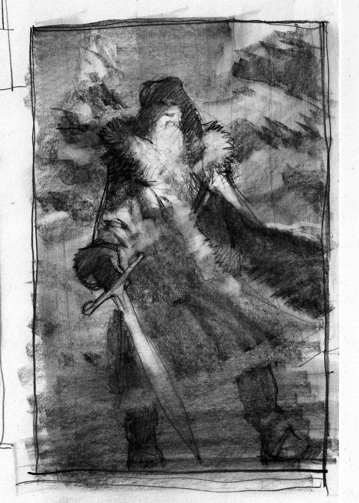
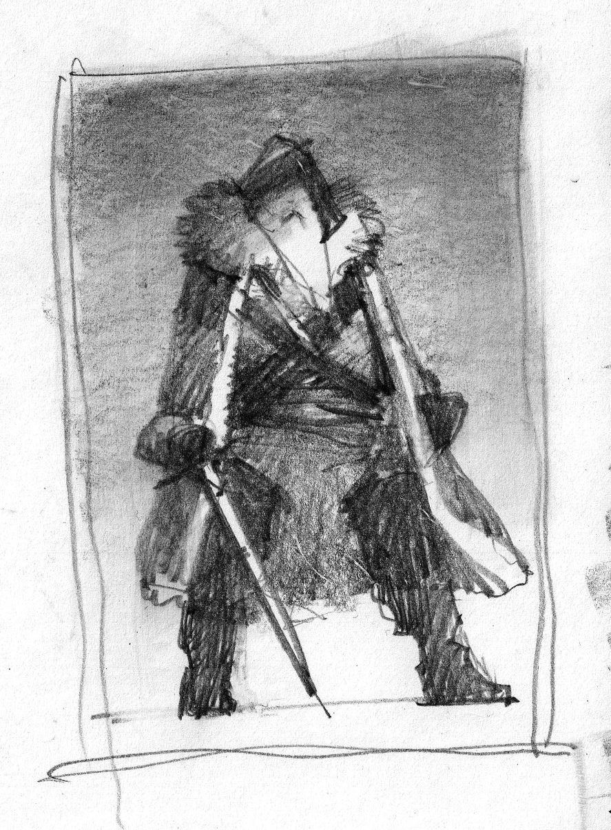
The first step in any commission is developing ideas. These ideas usually start off as really rough scribblings, and eventually develop into loose color sketches which I draw in Photoshop (seen below). When creating these sketches, I am taking special care to consider where the type will go over the image, and am sure to keep these areas relatively simple in design so they do not conflict with the predetermined layout. Because this image was to be used for a cover, as well as an ad, I had multiple type layouts to consider, as well as a specific color palette that I needed to stick to. These restrictions help narrow my options, giving me a good place to start, and a better idea of what compositions will successfully meet the client's needs. When I felt that I had 3 good options, all depicting Mal in different moods, I presented them to Scott for consideration.


Having decided on Sketch #1, the next step is refining the chosen sketch. To do this, I acquire mass amounts of reference material to aid me in making my image more realistic.


I began by taking a bunch of photos of myself dressed as Mal. Using a variety of random props I had laying around, I came up with decent costume that although is not refined, would give me the information I needed to paint a convincing image. I assumed a variety of poses, in different lighting set-ups, and shot several dozen pictures until I found something that I felt worked well. Since I would obviously be using Nathan Fillion's face, I was primarily concerned with the body pose.


More fun than I should admit.


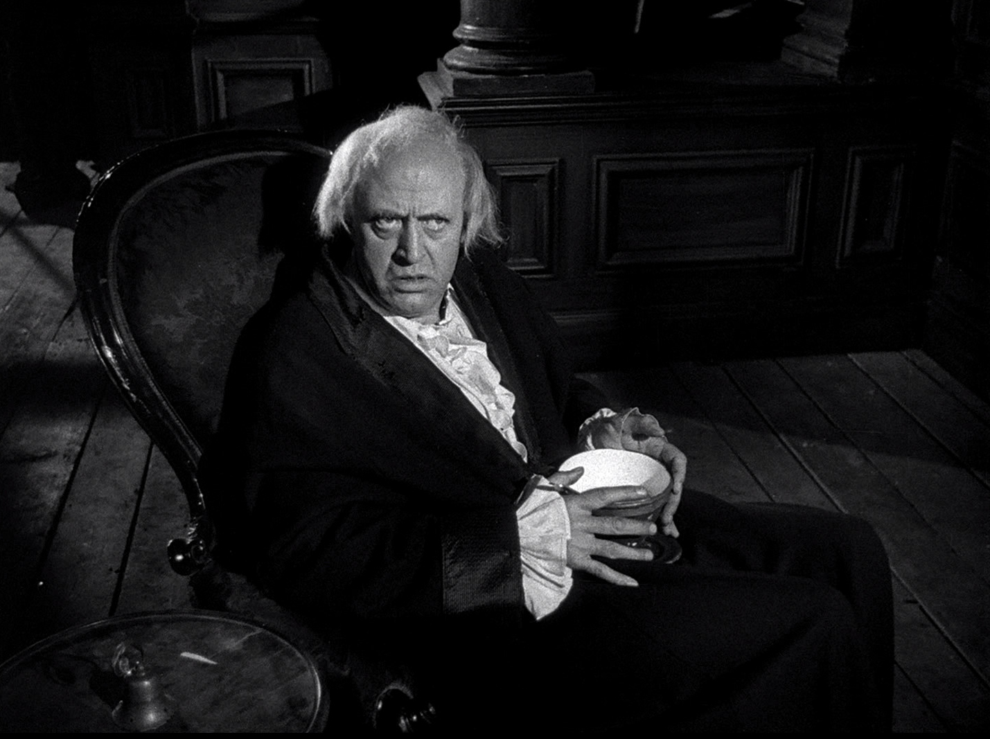
The next step was to seek out a good shot of Mal's face to put onto the body reference. To do this, I watched the entire Firefly series again, as well as Serenity, taking hundreds of screencaps whenever I saw a nice shot of Mal I thought I could use. I then went through all these faces, pasting them on to the body reference I shot with the help of Photoshop. Eventually, I found one that worked well. By combining screen captures, as well as custom reference, I can create a new image of Mal that is convincing, yet original.


I used a fairly similar method for Serenity herself, combining an amalgam of screencaps and 3D models to create the pose I needed.


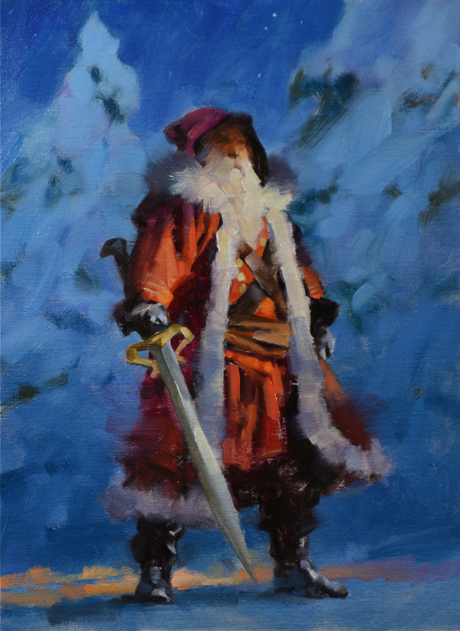
With all the reference in place, I can finally begin the actual painting process. I start by redrawing my image directly onto my work surface, in this case, Strathmore 500 series illustration board which I have primed with acrylic gesso. I draw using a mechanical pencil, a kneaded eraser and a blending stub. I don't bother drawing much detail in areas that I know will be painted loosely or out of focus. Instead, I focus on the important areas, really detailing out the face, hands, and costume of the main character. Once I am confident in my drawing, I spray it with a workable fixative to prevent smudging. (step A)


With a secure drawing in place, I can begin painting in oils. I start by toning the surface with a transparent wash of color, carefully preserving the white of the board in the particularly luminous areas. Not only does this give me a good working surface for subsequent coats of paint, but it also allows me to better envision the overall palette of the image, helping me to make more accurate color choices later on. (steps B & C)


Once the initial tone is dry (usually a day later), I begin painting more opaquely. I typically start with the background, since it is usually the messiest element to paint. Soft edges and lots of blending makes it very difficult to paint backgrounds 'around' a figure, so it's much better to start with them. (step D)


I gradually work my way forward, painting one element at a time. Most things get a single coat of paint, except for the face and hands, which sometimes require 2 or 3 passes before I am happy with them. (steps E & F).


After everything is painted, and dry, I do a final pass of transparent paint called 'glazing'. By diluting my paint with linseed oil, I  can create transparent layers of color that modify underlying layers, while not obscuring the details. This is a good way to alter colors and lighten/darken areas as needed until the image takes on a more cohesive appearance. (step G)


Lastly, I give the painting a few days to dry, and then give it a coat of retouch varnish. The varnish adds a nice even sheen to the painting, and allows me to take good photographs of the painting for reproduction purposes.


But the best part of this whole gig, even better than getting to paint your favorite TV character ever?Getting Nathan Fillion to release it publicly via Twitter! So shiny!