By - Jesper Ejsing

Thinking back on Illuxcon I realize that I said the same thing to everyone approaching me with a portfolio or asking me to review their artwork. Maybe it is because it is the one thing I got right, or maybe it is because it is something you can apply to almost every illustrative painting. Anyway; the thing is “Focal Point”.
Every illustration has an area where I want you to look first; a place that first of all, should draw the eye. That is the focal point. To me it is almost always the face of the hero or the main figure. That point should, in every way, be the brightest, the most detailed, the most saturated, the most contrast full and the place where all the compositional elements are pointing toward.
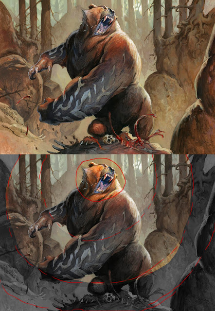
Like ripples in water, the further you move away from the focal point, you drain away color, detail and so on. In the farthest area away from the focal point the painting should seem almost grayish and on focused to not draw any attention at all. If not, the reading of the painting becomes confused and the eye starts to wander aimlessly around not knowing in which order to understand what it is seeing.
This image is an illustration called Rune Claw Bear from Magic the Gathering. To show what I mean I have circled in the area of interest, the focal pint, and added the “ripples”. The tools you can use for emphasizing the focal point is these:
Texture:
I try to add the most detailed strokes in the face and shoulder of the bear. The tongue is very detailed and the strokes are fine. Compare the rough and broad brush strokes in the cliffs or the stomach. In using different size of brushes I automatically get the texture difference I need.
Contrast:
I added the strongest rim light to the face and the shoulder. The black nose vs the white light, the light teeth vs the black hole of the mouth are sharp contrasts that makes this area look more important. It is the same rim light that is on the cliff behind his right claw, but I sucked out the light of it making the contrast much less obvious. Imagine what I white rim light would have done out there in the background?
Everything but the main figure has no super dark or black in it. It is all kept in less contrast to make it disappear.
Saturation:
I used orange/reddish brown around the focal point: yellow and white for the light. The rest of the Bear is more dark brown. For every ripple I go a bit more dark and less saturated. Especially in the background you can see it almost looks like there is a filter of more and more grey being put in front of the lens.
Brightness:
The lightest value will also keep the eye focused. That being said I think I needed a light source within the frame and added the sun shining through the trunks. It is a second focal point, but I consciously put it close to the face to even up. But still I kept the brightest part of the bear to the top and the face.
Composition:
I used the trunks and the cliffs as a frame for the figure. The tall vertical threes creates an ease that makes the dynamic shapes of the bear stand out: Also the sticks from the trunks points toward the focal point, the skeletal bones do the same. Even the arms of the bear points toward the face.
You can easily create a fantastic painting without getting every one of these points right. In multiple figure paintings you need to soften up a lot of the rules, but still, knowing what these elements do and how to play them, is a key to making a successful told story. And every painting is a story.
( even a little tiny story of a Bear saying “RAHHHHg, my kill. Stay away”)
No comments:
Post a Comment