Wednesday, October 31, 2012

10 Things... Applying Paint

Gregory Manchess


             Neil Young, for Rolling Stone Magazine, issue 1169, November 8, 2012


I've painted long enough to know that much of this list has become second nature. Neuroscientists call it 'automaticity.' Similar to driving, one practices the technical skills so that later our brain focuses on what's important: getting somewhere safely.


My favorite medium is oil paint, but these will enhance most painting styles.


Value range.

I start with darks first, to get the deep shadows laid in. Obvious places: nostrils, eyelids and eyebrows, mouth line. Next, I’ll put in broader, but slightly lighter shadow shapes like under the nose, under the eye sockets, under the bottom lip, chin, deep cheek bones, hair. I place the boldest shapes to establish deeper values, then work my way up through the darker values of color to the lighter values placed on top.


Avoid highlights.

Until the last bits of painting, I avoid the highlights as long as I can. Two reasons. One, I need to work my way up, so putting them in too soon will defeat that effort. Two, I leave something fun for the last. I delay gratification as long as I can. The best part of painting in oils occurs within the last few layers and strokes.


Vary forms.

Hair is a bold shape, not individual hairs. I study folds and constantly vary them. Repeating the same folds will kill a painting as dead as an assassin's shot through a pillow. I don’t think about the object I’m painting. I separate myself from the subject and only paint the form. I won’t 'follow' the form either. I cut my strokes across the surface of the forms. This adds dimension and lets objects feel sculptured.


New painters: Avoid primary colors.

Ultramarine Blue. It’s deadly. It’ll make mud faster than 35 school kids running for the bus. And no, Cadmium Yellow Light is not a miracle color. Get over it. Using it straight from the tube does not show how brilliant one is at mixing paint. Same is true for Ultramarine. New painters seem to think they are phenomenal because they used Ultramarine Blue straight from the dang tube. They step back and declare, ‘look at me, The Genius. I have explained the essence of pure painting by opening a paint tube and using yellow next to blue. Admire me.’


Using primary colors as a statement of painting brilliance screams ‘AMATEUR.’


Amount of pigment.

I trained to know just how much pigment is on the end of my brush. No matter how large or small, my awareness of the amount is paramount to good layers, good coverage, good overall effect in any painting.


I studied calligraphy. It taught me how to make letterforms with a brush or pen. Knowing the amount of ink held on an instrument for calligraphy is critical to achieve a skilled work.


Brush angle.

Calligraphy also taught me how to angle a pen or brush. Making letterforms is a key factor in learning to paint. I know many great painters who also started by copying letter shapes, making signs, copying comics (bang! zoom! pow!). They learned to handle the brush and at what angle AT ALL TIMES.


The angle of the brush helps lay down the right amount of pigment, at the right angle, in the right direction, with the right pressure to achieve a free and confident stroke.


Brush size.

I start with the largest brush for as long as I can and work my way down to the smaller brushes. Many times, as I near the end of a painting, or even slightly before, I switch back and forth. It’s a good, general idea to keep things from getting too focused too early.


Stroke speed.

Painting fast and loose comes the same way as anything else: with time. I painted very slowly in the beginning, placing my strokes deliberately, to look as if they were painted fast. Once down, it’s usually hard to tell the speed the stroke was laid. Over the years, I built up speed through confidence. It’s just plain ol’ experience. And LOADS of training.


Patient strokes.

I don’t judge my strokes too quickly. I lay it down, and press on. I come back to that area after a bit to judge whether it was the correct feeling, size, color, etc. I don’t lay one down, hate it, and take it off. Or worse, try to keep changing it.


At this point in my career, I lay strokes down that don’t make sense, but I let them sit. I find that they are just fine once I come back to judge them in context, against other strokes that are adding to the whole piece. Judging too early destroys spontaneity.


Scale.

I decide how I want the paint to feel once a piece is finished. I scale the brush size to fit the scale of the painting. If it’s a small painting in a magazine, I have to decide how clearly the strokes will be seen and what feeling they project to a reader.


If it’s a large painting and I want it to feel loose, I have to decide on the size that feels best. Paint it too large with small brushes, and when it comes down in reproduction, it can look too detailed. Too small with large brushes, and the piece can look too loose, too unfocused.


New painters can make the mistake of painting too small with too large of a brush and vice versa.


Tuesday, October 30, 2012

Happy Hallowe'en!


Gregory Manchess 


My favorite month, my favorite festival. I love this time of year because of the harvest, the hearthside in-gathering among friends, the creativity it inspires, and the promise of more celebrations ahead.


Have a happy one, everybody, 'cause...y'know...only 365 more days until Halloween...


Here's a link to a desktop wallpaper of Something Wicked This Way Comes from Tor.com!

What's in a Title?

by Justin Gerard


This is an excellent painting. The lighting, the composition, the execution, they are all excellent.  I look at it and don't know what is going on exactly, but I love it. I want to know more about it. I want to know what compelled the painter to make this image.


So I look at the title.


The title is "The Old Shepherd's Cheif Mourner", painted by Edwin Henry Landseer.


I enjoyed the technical excellence of the painting, but it wasn't until I read the name that I truly appreciated the painting's narrative excellence as well. I look at the painting again, and now the dog's face takes on a sense of loss that is heartbreaking. Layers and layers of story now begin to unfold around the image for me.


Most of the time I dismiss titles as unnecessary nonsense by which lazy artists prop up technically inferior work because it lacks the ability to stand on its visual merits alone.


And it is true that in the past there have been instances where artists have taken a shortcut to applause by coming up with names for their work that sound fashionable or hyper-intellectual.


There have also been hapless artists who just wanted to paint something simple, like a lake, because it made them happy, but who then felt compelled to add some title implying that the image is really a statement on the post-industrial consumerism or the plight of the proletariat in eastern bulgaria or some fashionable elitist cause. All because they were afraid of their work as being labeled sentimental or anti-intellectual because it was representational and wasn't shocking.


This appreciation of psuedo-intellectual titles seems to have fallen away somewhat in the past few years. (I personally thank Frank Frazetta and video games for this)


There even exist online name generators to lampoon the whole idea of this sort of naming. Consider http://noemata.net/pa/titlegen/, which will generate three pieces of abstract art at random, all with suitable titles.


However, this cultural reaction against fancy names has its drawbacks. And that is that we may forget the great value in a title.  I certainly do. In my efforts to avoid trying to sound pretentious I generally name my work something like: Painting #2, Monster #15, George Washington Field-Tackling a Bear #34 and so on.


But there is a classical use for titles. And that is to take an image that is already technically excellent on its visual merits alone, and then provide the viewer with further context and insight into it.


"The Old Shepherd's Cheif Mourner" is an excellent example of how a name can add to an image, and not be a replacement for technical excellence in one.


Lamp Post Guild Update:


Good news! In spite of my false promises involving domesticated camelid mammals, we somehow managed to meet our financial goal in the first 24 hours! So now the Guild is stretching its initial goals and is expandeding its course line-up.


To see what's happening check out: http://www.kickstarter.com/projects/pathwrightpress/the-lamp-post-guild


Monday, October 29, 2012

Spectrum: Call For Entries


Art by Iain McCaig


The Spectrum 20 Call for Entries is NOW OPEN! More info HERE.


Naama Kates Film to be Released in Theaters Next Year


IndieWire reports that "Eden," starring our own Naama Kates has been picked up for distribution and will be released in theaters soon! Here are some more details after the jump:


Phase 4 Films has acquired all North American rights to director Megan Griffiths’ drama “Eden,” which had its world premiere at the 2012 SXSW Film Festival. The specialty distributor has scheduled a release in theaters for early 2013.

Based on the true story of Chong Kim, “Eden” follows a Korean-American teenager who is abducted from a New Mexico bar in 1994 and turned into a sex slave in Las Vegas for two years before finally escaping. Jamie Chung, Beau Bridges and Matt O'Leary star. The film, which was written by Griffiths (“The Off Hours”) and Richard B. Phillips Jr., won the audience award for best narrative feature at SXSW as well as the Emergent Narrative Woman Director Award for Griffiths.

Colin Harper Plank and Jacob Mosler produced the project through Plank’s Centripetal Films.

“Megan Griffiths has created a superbly poignant and edgy film that is sure to move audiences,” said Phase 4 president and CEO Berry Meyerowitz. “We are thrilled to come on board with a project that has such a powerful story and exceptional performances.”

Phase 4’s Larry Greenberg and Katharyn Howe negotiated the deal with Cinetic Media on behalf of the filmmakers.

Phase 4 Films has recently released the films “Hick” and “Another Happy Day.” Forthcoming releases include “Electrick Children,” “Bindlestiffs” and “That’s What She Said.”

- Lena

Sunday, October 28, 2012

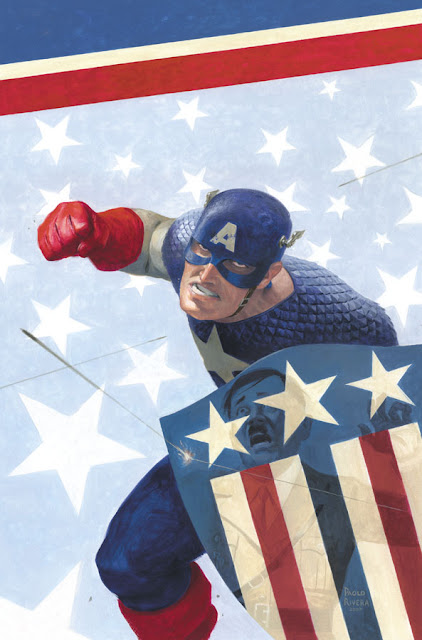
Painting Captain America


By Paolo Rivera


Mythos: Captain America. 2007. Gouache and acrylic on bristol board, 11 × 17″.


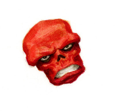
Captain America was the final installment in the Mythos series, a 23-page retelling of his origin. Now that I think back on the project as a whole, Cap was the only issue that wasn't "updated" for modern audiences. The reasons for that are (obviously) unique to Cap's personal story — created before America entered WWII, he preceded even the company that would come to own him. When Paul Jenkins and I were first approached with the concept, the main goal was to bridge the gap between Marvel comics and Marvel movies, easily done through the excision of anachronistic references.


Mythos: Captain America, Page 19, Panel 2. 2008. Acrylic and gouache on bristol board, 11 x 17".


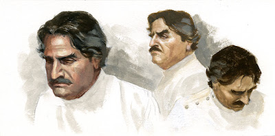
But Cap was different. This was a period piece that demanded earnest historical research. Every detail in every panel had to ring true, even though the story itself flirted with fantasy. While I used every source at my disposal, what often helped the most was the on-line community of WWII reenactors, whose dedication to accuracy — and willingness to share — afforded me an authority I would not have otherwise had.


Mythos: Captain America, Page 12, Panel 3. 2008. Gouache and acrylic on bristol board, 11 x 17".


When we started with the X-Men in late 2004, the Marvel brand was a competitive force at the box office, yet those movies were all produced by licensees. Marvel Studios had an ambitious plan, but its first movie, Iron Man, was still 3 years away. While we had less than nothing to do with those carefully laid plans, Marvel's publishing arm did want our schedule to coincide with at least some of those releases.


The series did less than amazing in terms of sales, but Marvel still followed through with the project until we had enough issues to collect into a beautiful hardcover. If nothing else, it proved to be a fantastic platform for jumpstarting my career — aside from being paired with a top-tier writer, I got to illustrate the cream of the crop in terms of Marvel characters. And all that while I was still a rookie: when they gave me the job, I had painted just 34 pages for them.


Mythos: Captain America, Page 18-19. 2008. Gouache and acrylic on bristol board, 22 × 17″.


The fact that I was commissioned to work on Marvel's flagship characters so early on was a privilege I recognized from the start, however, the benefits extended to my original art sales, which quickly became a third of my income (a much-welcomed addition since I was such a slow painter). If you're not familiar with the comic book art market, the price paid always comes down to which characters are on the page. Art is a commodity like everything else, and fame always trumps any intrinsic value. Captain America was (and always will be) more famous than me, but he has been kind enough to let me share in the spotlight.


With regard to my painting technique, it had not changed much since Mythos: Ghost Rider. I was a little older, more experienced, and more confident in my skills, but the basic process was the same. If you'd like more details about my methods, I took an exhaustive, 6-post look at the creation of the above page on my own blog. I don't paint much anymore, but when I do, the steps are basically the same.


Mythos: Captain America. 2008. Gouache and acrylic on bristol board, 11 × 17″.


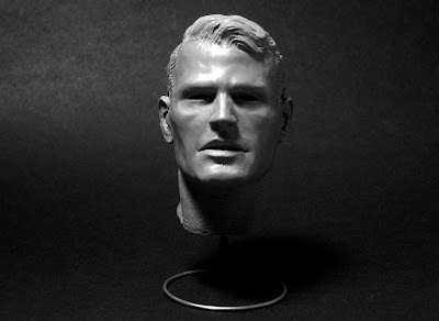
Steve Rogers. 2008. Super Sculpey Firm, 3″ tall.


Another practice that I continued with Cap involved sculpting maquettes. One of the things I love most about Marvel heroes is that they don't always look the part. In fact, Captain America was the first in the entire Mythos series who had the classic heroic look (despite the fact that he doesn't start out that way). Creating that square jaw from scratch ensured that I got exactly the look I was going for, panel after panel. This was the largest of the maquettes I've made — the head's about 2 inches tall — and I still use it as a general reference for all types of heroes. You can see more pictures of it here, and more about my sculpting tools here.


Mythos: Captain America, Page 14. 2008. Gouache and acrylic on bristol board, 11 × 17″.


Mythos: Captain America, Page 2. 2008. Gouache and acrylic on bristol board, 11 × 17″.


Cap's story was also a dream to paint because of the wide array of places and people that set his stage. At first glance, he may seem to be one of the most jingoistic creations of all time, but in terms of setting alone, his adventures spanned continents, from the Lower East Side to Italy to Russia to Tunisia. No other book offered such diversity.


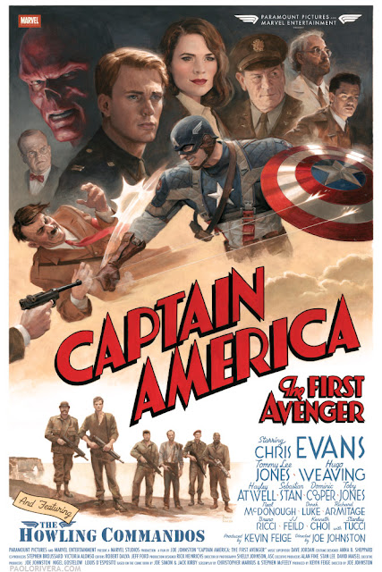
Captain America: The First Avenger. 2011. Gouache and acrylic on bristol board, 16 × 24″.


Perhaps one of the coolest things to come out of painting the issue was to be cited as an inspiration for last year's movie. Cap himself, Chris Evans, mentioned our issue in an interview about his preparation for the role (video below). To top it off, I also got to paint a limited edition poster that was given to the cast and crew, including Joe Simon, who co-created Cap along with Jack Kirby. I heard that he loved it, which is more than I could've asked for.


That wraps up this rather extended look at Mythos. If, by some incredible chance, you still haven't had your fill, here are all the Wacky Reference Wednesdays that feature art from Cap: week 12, 24, 32, 33, 3539, 404967, 707172, 737779, 8081, 83, 9199100, 109, 110113, 122139, 140154, 186, and 190. There's also plenty more of the original art that can be seen at Splash Page Comic Art.


Friday, October 26, 2012

Book Review: Elysium


-By Dan dos Santos


As many of you know by now, I love to collect art books. In fact, I think it's safe to say that my interest borders on a compulsion. I have a lot of really cool, and hard to find art books, and I've always wanted to share some of them with you guys.


For ages, I've meant to do some video flip-throughs for you, but always postponed it because I just wasn't set up to do it properly. My tripod isn't the right size, my studio is too dirty, my camera has a horrible microphone... you get the idea.


Well, I'm still not set up to do it properly, but I figured I'd do it anyways. What's the harm, right?


I promise that in future reviews the video quality will be better, there will be less glare, and I won't be breathing into the microphone like an asthmatic dog.


To start us off, our first book review will be 'Elysium: The Art of Daarken'. This book just came out a few days ago, and I thought it may be good one to start with since many of our readers will likely be hearing about it over the next few days.


'Elysium' is available for purchase on Amazon: http://www.amazon.com/Elysium-The-Daarken-Mike-Lim/dp/0956817130/

Paris, Querétaro, Minneapolis & Paris


-By Serge Birault


The last two weeks were incredible. I spent several days on planes, trains, bus, cars and I met a lot of amazing artists on different events ...


CFSL Workshop (Paris - France)

http://www.cfsl-workshop.com/


3 days of workshops with various artists from France (and also from Mexico). Small audience but very friendly. A good opportunity to see some friends too ...


Simon Loche, concept artist.


Hubert de Lartigue, our french airbrush Master.


Tony Sandoval, illustrator.


Me, trying to explain why I don't know any shortcuts ...


Jean-SĂ©bastien Rossbach, illustrator.


Marc Simonetti, illustrator.


Illustrators Deathmatch (Querétaro, Mexico)


2 days of workshops/live demos and one day of challenge. It was my first in Mexico and I have to say it was fantastic. Everybody was so kind and Querétaro is a so beautiful place.


The audience was very huge and very, very friendly. I met the other artists for the first time and we were like a small family. Hope I could go back to Mexico soon ...


Photo by Pedro Conti


Mostasho, illustrator.


 Photo by Pedro Conti


Gina ChacĂ³n, illustrator.

(http://saiyagina.deviantart.com/)


Photo by Pedro Conti


Goñi Montes, illustrator.


Photo by Lidia Candelario


Maroto Bambino a.k.a Bambinomonkey , illustrator.


Pedro Conti, 3D artist.


Photo by Pedro Conti


Me and my two translators :)


All the gang ...


Exhibition Tentacle Trance: Slithering Sensuality in Illustration 

( Minneapolis College of Art and Design, U.S.A). 


I wasn't able to go to Minneapolis for this one because I was in Mexico.


Here's a list of the featured artists : Christopher Conn Askew,  Rubens Cantuni, Igor Carteret, Camilla d'Errico, Rudy Fig, Tomer Hanuka, Natalie Shau, and Vladimir Tomin.


It's always very strange for me to have my pictures on an art college. Pin ups are not always welcomed. :)


Exhibition at "Les Furieux" (Paris, France).


November, 6th - December, 2th.


Opening : November, 8th.


My next exhibition will be in ... a rock n'roll bar. I like the idea to show my pictures on this kind of place. So if you are in Paris next month, you know what you have to do :)


Wednesday, October 24, 2012

Messy Surfaces


-By Donato


Joan of Arc-On the Field   detail   2012  Donato

One of the major changes I have gone through in how I paint is in the willingness to make mistakes in my paintings and then find a way to correct them.  It becomes a game of chase, seeking out the right value, color and edges from the 'incorrect' mass in the painting, forming it back into submission as I seek the perfection of form and atmospheric effects I see in my minds eye.  Thus rather than attempting to create a perfect stroke in the direct application of the paint, I now prefer the game of chance as I seek resolution out of additional marks into a mess of pre-existing color and paint. This is closer to an act of playing and discovery and less one of knowing.


This change has not been a conscious shift, but rather an evolution in the relationship to my art.  Before, I was a creator, delivering realizations of the unknown to my audience to dazzle them with special effects of surfaces or renderings of the surreal.  But now I am spending more time thinking about what these images mean to me.  Why am I am painting?  What am I painting? These issues have reassessed how I relate to a painting as a physical object, and increased my fascination in the surface quality of the paint.


I find a complex surface an intriguing part of the visual art experience, increasing the time I spend engaged with a work of art.  Is that a red-brown I see in the blue sky?  A flash of brilliant yellow on a cheek?  My assumptions about what color is and how I need to control it are challenged as I find more visceral interactions grounding my artistic experiences.  My works are getting messier as objects within the visual field merge together, becoming less iconic and individually defined from their surrounding elements.


I cannot say why this change is occurring, but only that it is opening new doors on how I am interpreting my subjects.  I am driven less by the need to describe my forms, and more the need to present how they feel.  It is a wonderful way to begin another phase of my career with the human figure.


I hope you enjoy the journey with me.


Joan of Arc-On the Field   detail   2012  Donato


Vincent Desiderio    Boating Party    2010


Bastien Lepage    The Wood Gatherer   detail


Jusepe de Ribera   detail

Soft Legs and Iron Armpits


By Jesper Ejsing


This is a magic card illustration from a while back. The description asked for a girl being enchanted with dangerous giant blade-like spikes bursting out of her body. 


When I first start of sketching a card illustration I do plenty of loose thumbs. Some are abandoned half done or as soon as I realize it is going nowhere. The goal is to get the idea for a pose or angle for the image right. And the way I do that, is often very fast and very aggressive. I stab lines into the paper, constantly sharpening my pencil, as if it was a sword meant for battle. I am convincing myself that the fast paced scribble resampling panik, is my secret way of keeping the drawing dynamic...in truth I would rather slow down and trade some dynamic for control. 


When I do hit something that my stomach tells me is right. I scan it and add some values or a single color and send it off for approval. Like the sketch you see here. 


When it is approved I am ready to go. What happens now is guilt, loathing and an evil voice in my head saying “ You think this is good? you can do better, you should have done better” This is when I start redrawing the thumb. In this case I tried to get the pose more strained and more like an “end-position” of a movement. In the thumb she looks too relaxed and almost flexing. The new attempt has swing and twist in the torso and the arms and especially the gesture of the clenched wrists, clearly visible in the silhouette, works so much better. I spent the most of the afternoon adding equipment to her costume. Realizing now how dumb it is, that her inner thighs are exposed to wind and weather and raunchy gazes but her armpits are protected by thick ring mail. I can only say; some of us know how moist the thighs can get in a tight leather outfit.  I gave her a little necklace with a small flask containing some pink liquid. Perhaps it is the potion she uses for extending the blades. There is no way you could see that flask in the final card art, but I like to think of small details like that. And also, since the armpit mail is such a stupid thing, at least the flask is a small token of storytelling. 


Most of the time I aim for the dynamics to be in the thumb and for it to stay there through all of the process of sketching and painting towards final. But when you see a way to improve you initial drawing it would be traitorous to ignore that even if the client already approved the sketch or even if you are already in the beginning of the painting. I have no count of how many times I started all over because of a wild hunch or a glimpse of something better.

SoI Student Scholarships


Each year the Society of Illustrators hosts a student scholarship competition and it is always enjoyable to see the results. Visit the SoI website for a sneak peak at the artists today who might very well be movers and shakers tomorrow.


[Art above: "The Haunted Hallway" by Samantha Schechter, a student at The University of the Arts. Instructor: Tim O'Brien.]

Monday, October 22, 2012

Not So Bright


-By Dan dos Santos


Here is a piece of mine that just went public not too long ago. This painting is for the cover of the graphic novel adaptation of 'Alpha & Omega', by Patricia Briggs.


I wanted to share this piece with you because it is a really good example of why value and saturation control is so important.


I often get asked how I get my colors so bright. Well, I'm going to show you how.


Most of you probably understand the concepts of contrast when it comes to value and complementary colors. For instance, if you want something white to stand out, surround it by black. Likewise, if you want something blue to stand out, surround it by orange. But there are many other means of contrast, and in this case, saturation is doing the heavy lifting.


I knew I wanted to have glowing blue eyes in the image, in fact, the entire concept revolved around it.

But I also wanted to have a blue tint to the background. This means I couldn't rely on a complementary color to make them pop. So instead, I had to do it with value and saturation.


By placing the darkest values right in the pupils of the eye, I made the whites appear much whiter than they really are. Even at the drawing phase, the whites of the eyes already appear whiter than the board they are drawn on. This is obviously impossible (and in fact they are actually a little bit darker than the board), but our eyes perceive it otherwise. Go ahead, zoom in on the image above. You would swear the eyes are whiter than the rest of the image, but they are not.


As I painted the image, I took special care to make sure every single color I mixed was just a little darker, and a little grayer than I would normally paint. The duller I made things, the more the eyes stood out.


So how I get my colors so bright?

The secret is... I don't.


If you want something to look bright, you just need surround it by really dull stuff.

(I'm sure there is a politic joke in there somewhere)