By Paolo Rivera
 |
| I totally doctored this official Wacom photo. |
I just upgraded from the Cintiq 12WX to the 13HD, so I thought it might be a good time to share some of the tips, tricks, and general practices I've developed over the last year and a half of digital drawing. I held out for many years before making the digital leap, but I'm glad I finally did. My apologies in advance to those not in the digital drawing camp — this is going to get pretty technical for 2 posts.
I prefer the smaller Cintiq because I don't like drawing big. It's one of the few things that my art school teachers chided me for that I never came around to (I understand their point, I just had different goals). Plus, I feel like the 24HD version would dominate my work space — I like to leave room for other, more traditional modes of creating art. Lastly, I just don't like moving my arm that much. If you sit and draw full-time, every extraneous movement can start to add up.
 |
| Avengers 34 Digital Composite (step-by-step) |
As for placement, the small size allows me to keep it in front of my computer, hanging off the edge of the desk. (The 13HD's new stand doesn't allow the same degree of overhang, but I like the new angle.) Essentially, it operates as a second monitor, so the only thing that ever graces that screen is the drawing.
Since I have 2 monitors, I use 2 windows for the same project. Under Window > Arrange, you'll find the "New Window for..." option. After moving this window to the Cintiq, I can switch between the 2, depending on the task at hand.
 |
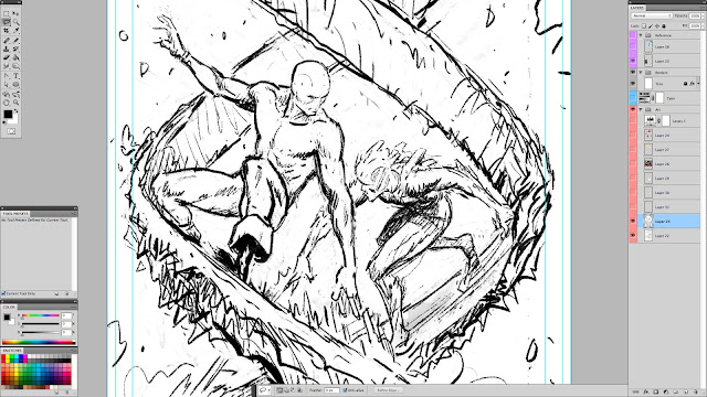
| my Cintiq screen at actual resolution |
The trick to using both screens seamlessly is the "Display Toggle," which transfers the cursor from one screen to the other. (If you do this while grabbing a window, it will send it to the other screen.) By assigning this function to the upper button on the pen, I can use my drawing hand to switch between screens. (More on button assignments next time.) Also, under your computer's display settings, you should be able to specify the orientation of the 2 screens to each other so that the cursor travels between them in a close approximation of real space.
 |
Daredevil #9, Page 9 Digital Sketch. 2012. Photoshop. |
Speaking of work spaces, Photoshop enables users to position palettes and save arrangements according to taste. I use 2 distinct modes. "Layout" is for work that doesn't require direct drawing. This includes coloring, post-production corrections, and graphic design (and any non-graphic work). While I'm still using the Cintiq to navigate about the screen, I'm not looking at it (much like an Intuos tablet), and so all my palettes are on the main screen. My "Cintiq" work space moves the application bar and a handful of palettes — tool, layers, color, and swatches — to the Cintiq. Those are the ones most useful for drawing and painting, but they're small enough to leave room to work. (If more room is needed, pressing F6 clears away the color palette, and Tab removes them all.) A nice consequence of the HD upgrade is that even though the screen is roughly the same size as its predecessor, there's more room to draw because the palettes take up less space in high-definition.
 |
| breaking in the new Cintiq 13HD |
My favorite drawing trick was assigning the "x" key to the bottom button on the pen. This alternates between the foreground and background colors which, when sketching, I always set to black and white (by pressing D). As a result, I can draw easily with either color without resorting to the eraser. In the next post, I'll talk more about button assignments and tools.
 |
| digital painting from my Iron Man 3 poster |
No comments:
Post a Comment