Hey Everybody.
I have been chosen to do the next round of critique. I am glad, and frightened. First I would like to say the corrections or suggestions if you like, is only examples of what I would have done different, and not necessarily true or even better. But since I also tell why I would change these elements I hope you can gain something out of it.
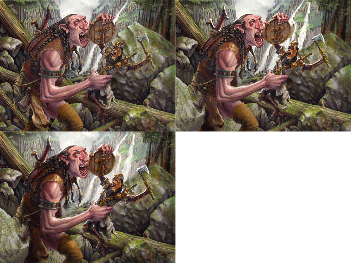
Among the many pictures sent in, I chose this one by Anthony J. Schmidt. I like the image. It portrays a situation like most paintings I do and I feel most confident in criticising analogue painting. This one was done in watercolour.
First off. To me the most important thing in an illustration is telling a story, and telling it clearly. There should be no need for explanations and you should be able to “read” it right away. What I focus on when doing a scene like this is: clearly readable silhouettes, foucs via details and color intensity, and clearness in forms. That means getting rid of tangents.
Here is what I think Anthony’s painting needs to be a bit more easy to read:
The fighter kind of disappears into the background. He has basically the same colours as the background and the shapes in the cliff behind him makes him difficult to see. The head is the most important thing. It is immediately what draws the eye, so I came up with a simple solution: to make his head a clear silhouette I added another waterfall behind it. That way, painting over a part of the cliff giving the whole area behind his head and axe a less busy texture. Also it makes the head stand out as a dark patch on white background. Doesn’t get much clearer than that.
 |
| Added waterfall behind warrior's head. |
Well, I needed the area to be more calm so I just copied the cliff behind the fighter and made it into a large stone, creating a calm and light area with out too much contrast. This way, we read the backside of the giant better. I also lighted the triangle between his legs to make them clear.
 |
| Simplified the area behind the giant's legs. |
 |
| Added consistent lighting to the giant's shoulder. |
 |
| Added rim-lighting to both figures. |
 |
| Boosted the color saturation around the focal points. |
Also I have tried to convey the difficult choices you face in doing a scene in an illustration. Using the tricks of focus can be difficult and should only be used the important places or else the eye gets lost. I have added a piece I did a while back that had some of the same problems. But it shows how you could use focus to clear up a very busy image. The background for example have almost no trunks and no leaves at all, just messy broad strokes of blue and green. Yet you are not in doubt that it is a forest. Try imagining the same image with a full detailed forest behind where I had rendered every leave and bark structure in the trunks. Think of the eye as a camera that can only focus on one thing at a time. The simple background makes the detailed stuff seem more important. It is a matter of choosing your guns right. Same goes for the less important arms and especially the feet. I just made them flat and without much contrast. What I did instead was punching out the colours and the details on the faces and the ground right between the ape-demon and the last man standing. This area is the only part of the background that needs focus. One last thing: I used a very warm and heavy reddish colour for the Ape and a very light and cool colour for the background behind him to pull the 2 elements apart.
I hope you enjoyed this little paint over. I could talk on forever, but I need to fix a painting now that I am doing. It has lost all focus and is only a muddy patch of undefined brown. With all my own advice still clear in my head I might as well take a bold and dramatic choice.
-Jesper
A note from Dan:
I would also like to quickly chime in on this piece. I could not agree more with Jesper's assessment of the piece. To me, above all else, legibility is most important. Though, I think that this piece can be pushed even further by controlling the value structure a bit more.
By hazing out a few of the background elements, and darkening the shadows on the figure, we can better emphasize the silhouette. Most notably, I added a bit more white behind the warrior's back, and a few cast shadows on the giant.
 |
| Reduced contrast and lightened the background. Heightened contrast and darkened the foreground. |
Below is an animated gif showing the three major stages of Anthony's painting:
Thanks again to all those that submitted this round. Your interest in greatly appreciated, and as usual, the submissions were all really wonderful to look at. Stay tuned, as we'll post info about the next Crit-Submit soon!


No comments:
Post a Comment