Here is an illustration I did a year ago for Wotc.It is 2 fighters, a girl and a guy, but the guy is a werewolf and is newly transformed. The setting is a tomb. As always I am using acrylics on watercolour board. It measures 50 x
Step 1
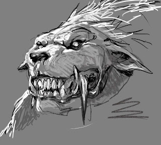
 I used countless references of wolfs and had 2 books on wolfs resting almost on top of the drawing for a whole day, still not being able to nail anything usable. I think the problem in using the photo ref was that it constantly became just a big guy with a wolf head. In my head the face had a human facial expression, and that is one pretty hard thing to search up on goggle or in a book. What finally succeeded was that I used my laptop at home when I was far away from all my ref and my drawing. I sketch a head digitally ( the change of media also had a thing to do with it ) and turned the other way, because at that point I had tried every thing possible facing right. And within minutes I got it right. After transferring to board, I inked the whole thing and add all the grey tones and black.
I start out with a bunch of thumbs. Mostly I search for a solid shape or silhouette. In this case I new the 2 figures needed to stand close, so I needed them to overlap in a clear way. One idea was to have the biggest of the 2 kneeling thus making more space to the female. Also this composition I think is more dynamic than having them stand straight next to each other.I was so happy with my thumb that I didn’t rework it as a sketch. All I did was to add a grey tone in computer and cleaning out the rim lights with a digital brush. In my sketches I use graphite powder for grey and an electrical eraser for cleaning the whites. But this thumb was so small that it would have been smudgy.
Step 2
My Art Director Mari said that the swords was too big. So when shortening them the one resting on the ground was moved to rest on her shoulder. I sketched each figure separately adding the equipment and constantly trying to get the best and most powerful drawing while still keeping my original silhouette from the thumb. When I am happy I transfer them both to the board and draw in the background. The absolute most difficult part was the wolf head.
 I used countless references of wolfs and had 2 books on wolfs resting almost on top of the drawing for a whole day, still not being able to nail anything usable. I think the problem in using the photo ref was that it constantly became just a big guy with a wolf head. In my head the face had a human facial expression, and that is one pretty hard thing to search up on goggle or in a book. What finally succeeded was that I used my laptop at home when I was far away from all my ref and my drawing. I sketch a head digitally ( the change of media also had a thing to do with it ) and turned the other way, because at that point I had tried every thing possible facing right. And within minutes I got it right. After transferring to board, I inked the whole thing and add all the grey tones and black.
Step 3
I scan the grey tone/black and white board and print out a copy. On the print I do my colour rough. This painting was going to be one out of 6 covers in a series so I needed a strong and clear colour theme. I settled on red/purple. The rough I thought was a little over the top, so when moving to painting I decided to tone it down a little to keep it less happy and colourful. It is a werewolf anyway.
I masked out the figures with frisket film and started with the background. I quickly block in all the areas and then start working out the details. It almost looks like the stone pillar is disappearing in the bottom behind the werewolf, but I needed that space under his arm to be very light to be able to read the silhouette.
The face of the girl was a step further in the direction I have been going for the last 2 years. I added freckles and small cuts and greys to make her look dirty and real. The hair was a challenge and I had a girl pose for me and draped her long dark her to fit my sketch. The final is a mix between her hair and that of Pam Anderson's.
The werewolf was going to be having bits of armour strapped to places on the body as if his transformation had burst apart his equipment. I like the part of the ring mail that hangs in small chains underneath his neck. I promised myself NOT to do the rings individually, since that is just plain stupid and uncalled for, but here I am painting each ring individually. I am glad I did.
One thing that I am particularly happy with is the face of the wolf guy and the small differences in tones and value in his face. I got the exact expression I wanted: Something in-between panting, snarling and just crazy. ( that is what I myself remember best from transforming ).
When doing the legs and the rock he is resting on, I just got tired and feed up with it. I pulled away and went for a walk and when I got back I decided to just leave it at that. I was going to render all kinds of stuff, but I think it is better off with areas not too overworked or detailed. It needs areas where the eye can rest without having to decipher details and elements. That being said I wish I had clarified the area from foot to leg.
If you guys and girls out there have anything to ask or add feel free to do so. I would happily answer all. I have only focused on stuff that I can remember and being all cradled up into my own way of doing things I might have skipped or left out important facts.


No comments:
Post a Comment